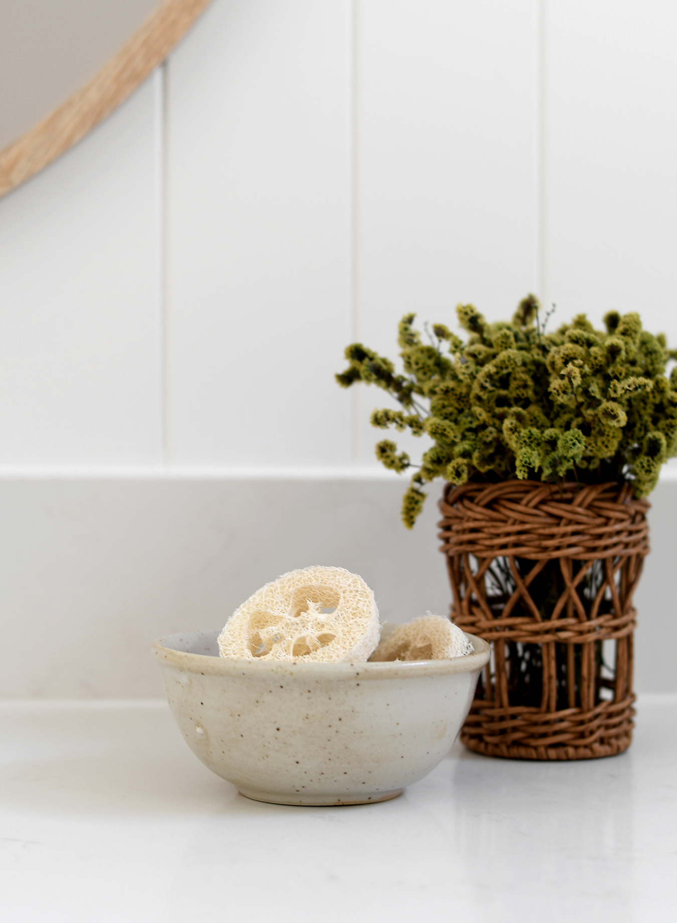

I feel a little bit sheepish sharing this remodel because I know lots of you will prefer the before. And, if I’m honest, there is plenty about its prior form I really did love! But sometimes change is forced.
I’m sure many of you will remember this cosmetic refresh I carried-out on my parent’s main bathroom back in 2018…


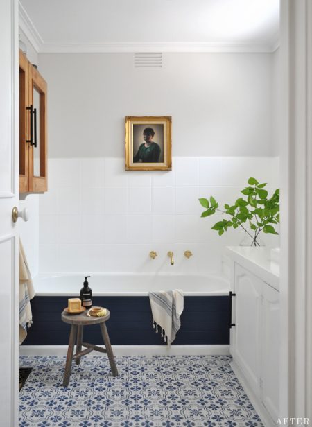


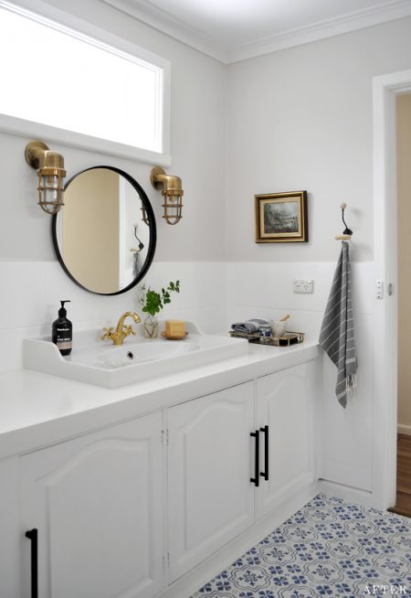

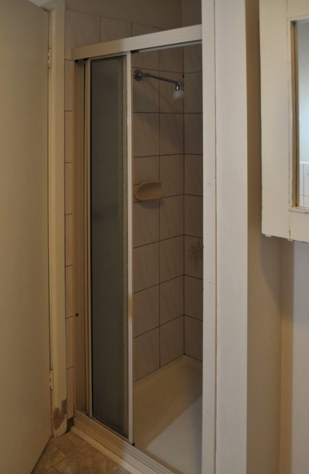

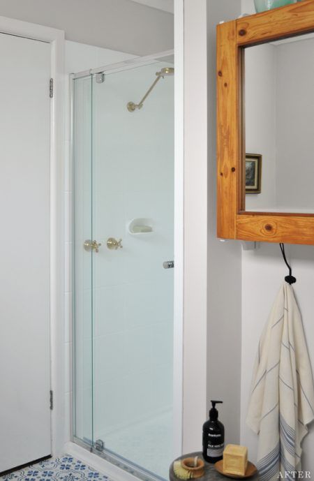

It was a really popular makeover, and a project I found super rewarding.
At the time it was a bit of a creative experiment, and intended as a somewhat short-term fix – as the room had some layout impracticalities and “old age” problems which would eventually need addressing – though five years on it was still going strong! The fact is, it would be unchanged today, had it not been for an unforeseen issue which eventually resulted in this…
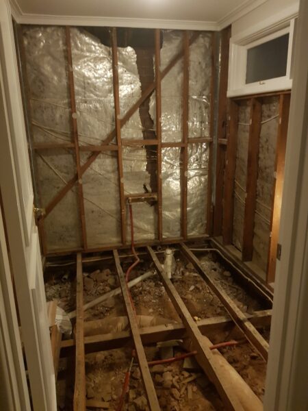

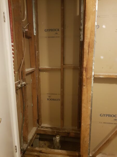

One day my dad was walking by when he heard a faint trickle coming from the direction of the bath. Turns out one of the old pipes had burst and was slowly leaking into the wall cavity! After lots of examination and some professional opinions, it became apparent that the only way to access it was to rip the entire bathtub out! This, obviously, has its knock-on effects!
Although the timing wasn’t perfect, my parents decided it was the catalyst they needed to properly remodel their 50 year old bathroom.
The first thing to determine was the new layout.
Having the vanity beneath the window was never ideal, plus my parents wanted to introduce a toilet (which does make sense because this bathroom services three bedrooms and the nearest toilet is on a different level).
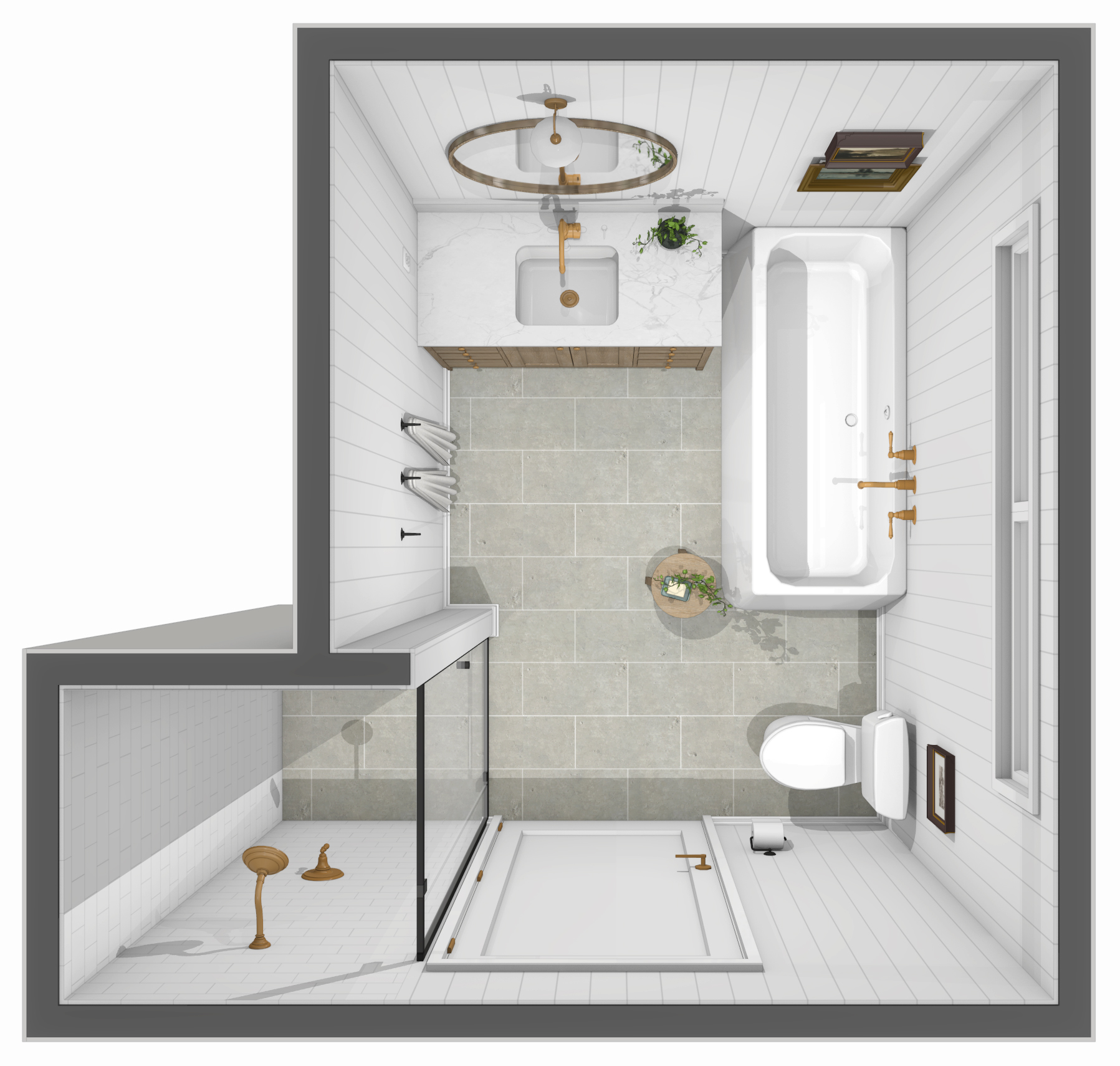
The position of the door, window and walls couldn’t be altered, so I played around with a few different layout ideas. These are just some of the options…
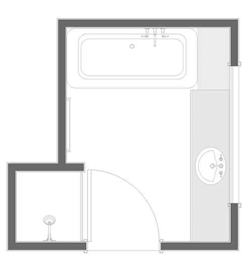

ORIGINAL DESIGN (ABOVE)
- Vanity beneath window not ideal
- No toilet
- Bath ledge a dust catcher
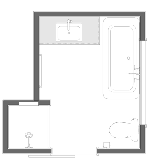

CONCEPT 1 – SELECTED DESIGN (ABOVE)
- Nice sight line to vanity and bath
- Toilet tucked in corner
- Ample floor space and good flow
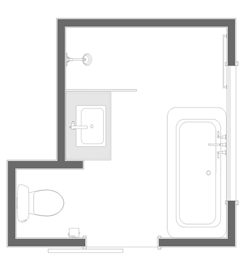

CONCEPT 2 (ABOVE)
- Smaller vanity not ideal
- Distance between bath and shower glass too narrow
- Distance between bath and vanity not ideal for flow


CONCEPT 3 (ABOVE)
- Vanity positioned partly beneath window not ideal
- Smaller vanity not ideal
- Distance between vanity and shower glass too narrow
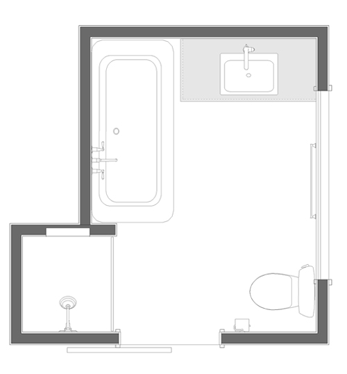

CONCEPT 4 (ABOVE)
- Alternate bath and vanity placement for Concept 1
- Sight line of bath and vanity not preferred
- Bath partly obscured by wall portion


CONCEPT 5 (ABOVE)
- Toilet quite prominent from doorway
- No sight line to vanity
- Distance between vanity and bath not ideal for flow
My initial thought was to “hide” the toilet in the shower nook, though this left limited options for the shower placement, mainly due to the window. And although it’s hard to tell from the layout plans alone, the width of the room makes circulation paths too squishy when main elements are positioned opposite one another.
After weighing up the practicalities, costs and aesthetics, the selected design came out on top.


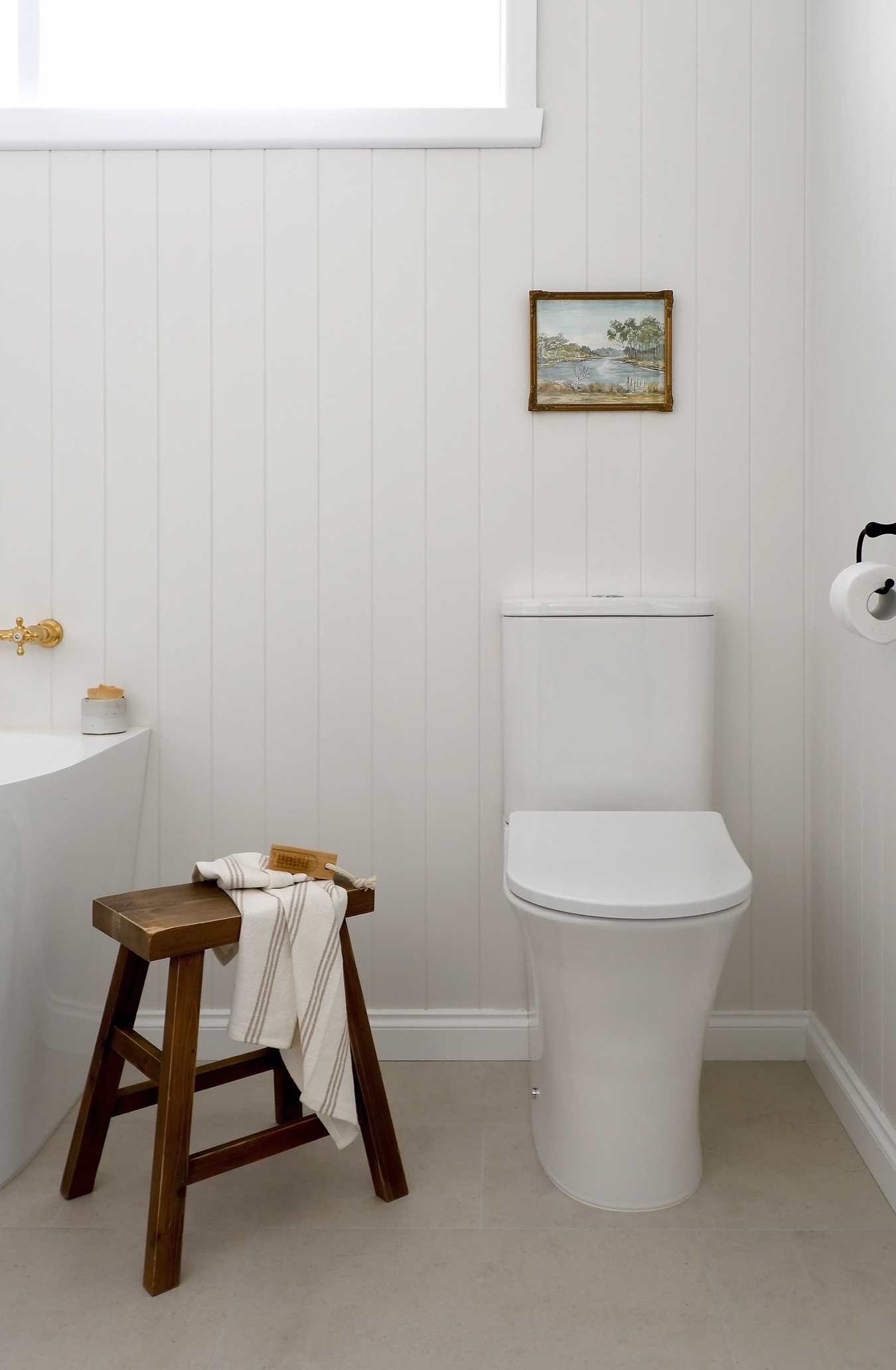
Whilst the area beside the door seems like a prominent position for the toilet, the reality is you look forward toward the vanity and bath so it’s actually far from the first thing you see as you enter.
The next step was contemplating the style, and ultimately deciding on the selections.
Unlike the past iteration of this room, which showcased colour and pattern, I knew my mum would want to stick with simplistic neutrals. She is a conservative decorator who values longevity in design. It was really only the temporary DIY nature of the previous cosmetic refresh, paired with my “gentle” encouragement, which lent her the courage to go somewhat bold.
In keeping with the overall feel of my parent’s house, a light and airy scheme with a balance of classic and contemporary was the way to go.
We chose warm whites, earthy materials, mixed metals and timeless elements for a crisp and welcoming vibe…
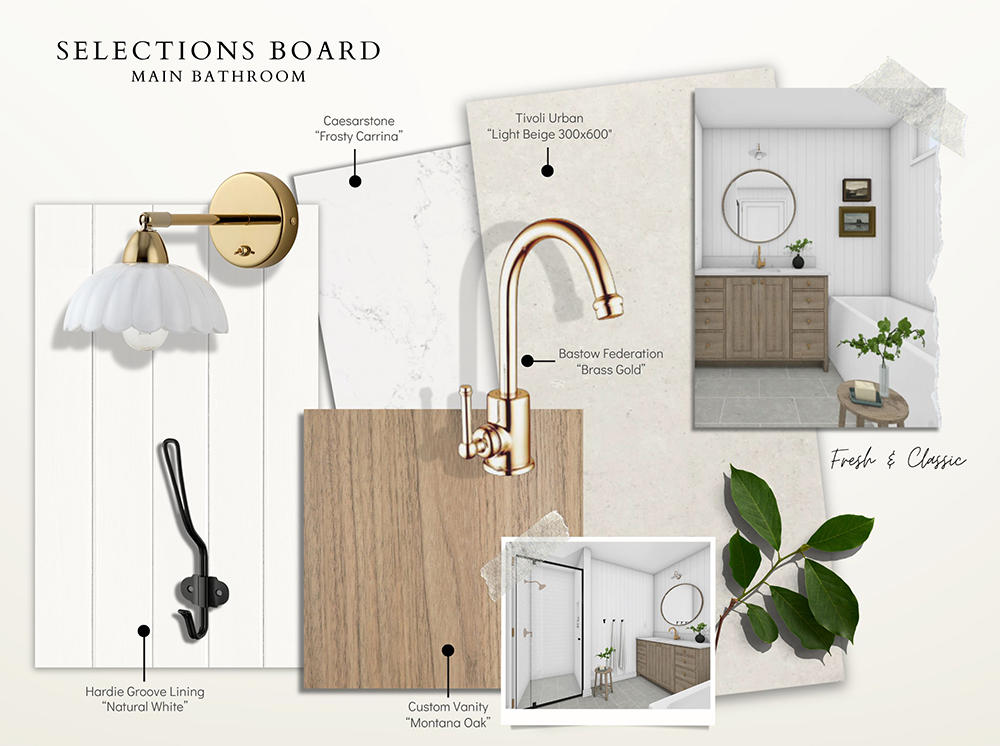


Although nothing we selected was super expensive, the tapware and vanity were items my parents were willing to spend a little bit more on. This was balanced with affordable products elsewhere. Plus the use of wall panelling in place of floor to ceiling tiles, which is a much cheaper alternative. So, whilst I wouldn’t call it a super budget savvy reno, it could easily have cost loads more.
And here’s how everything came together…
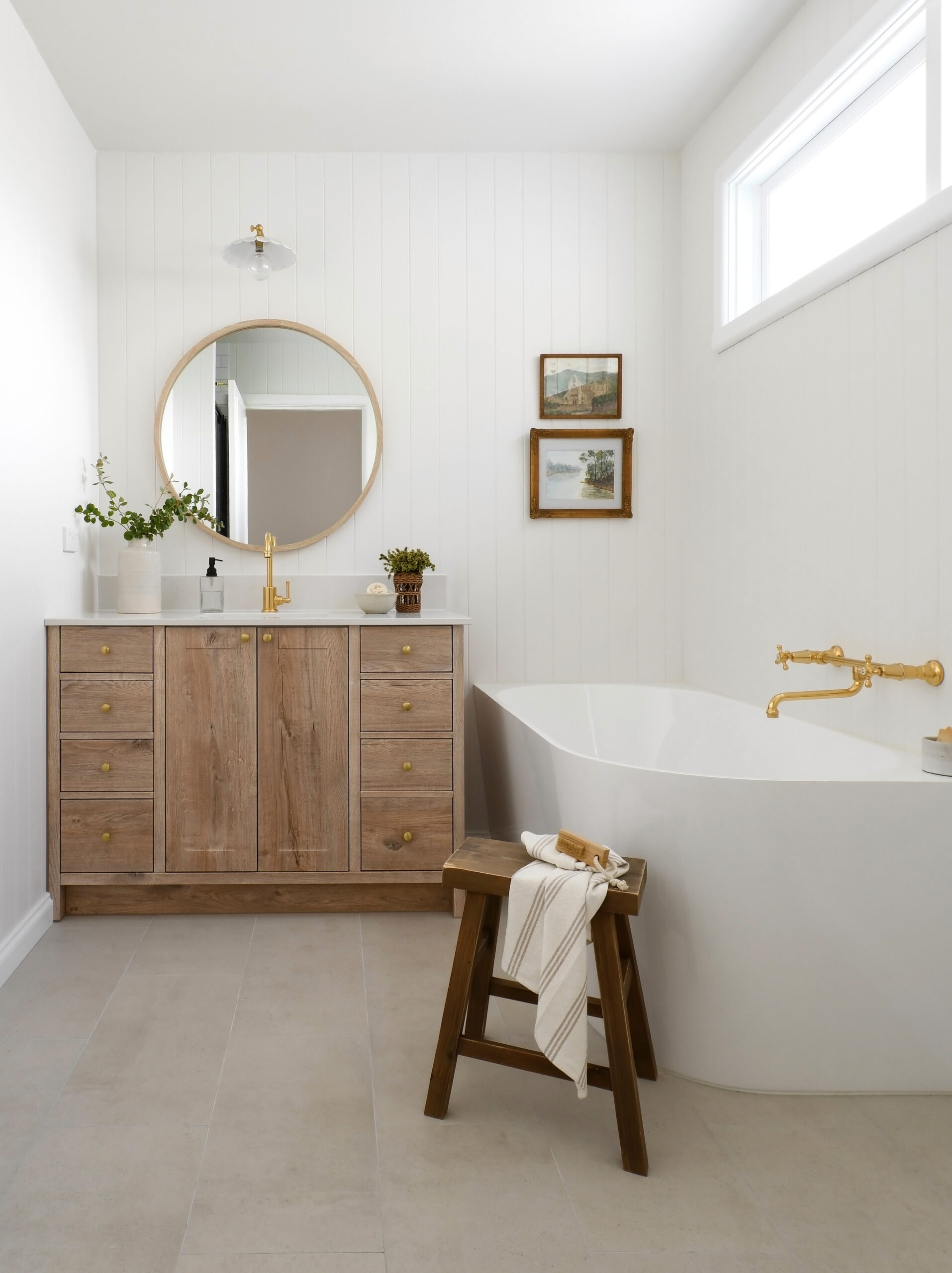





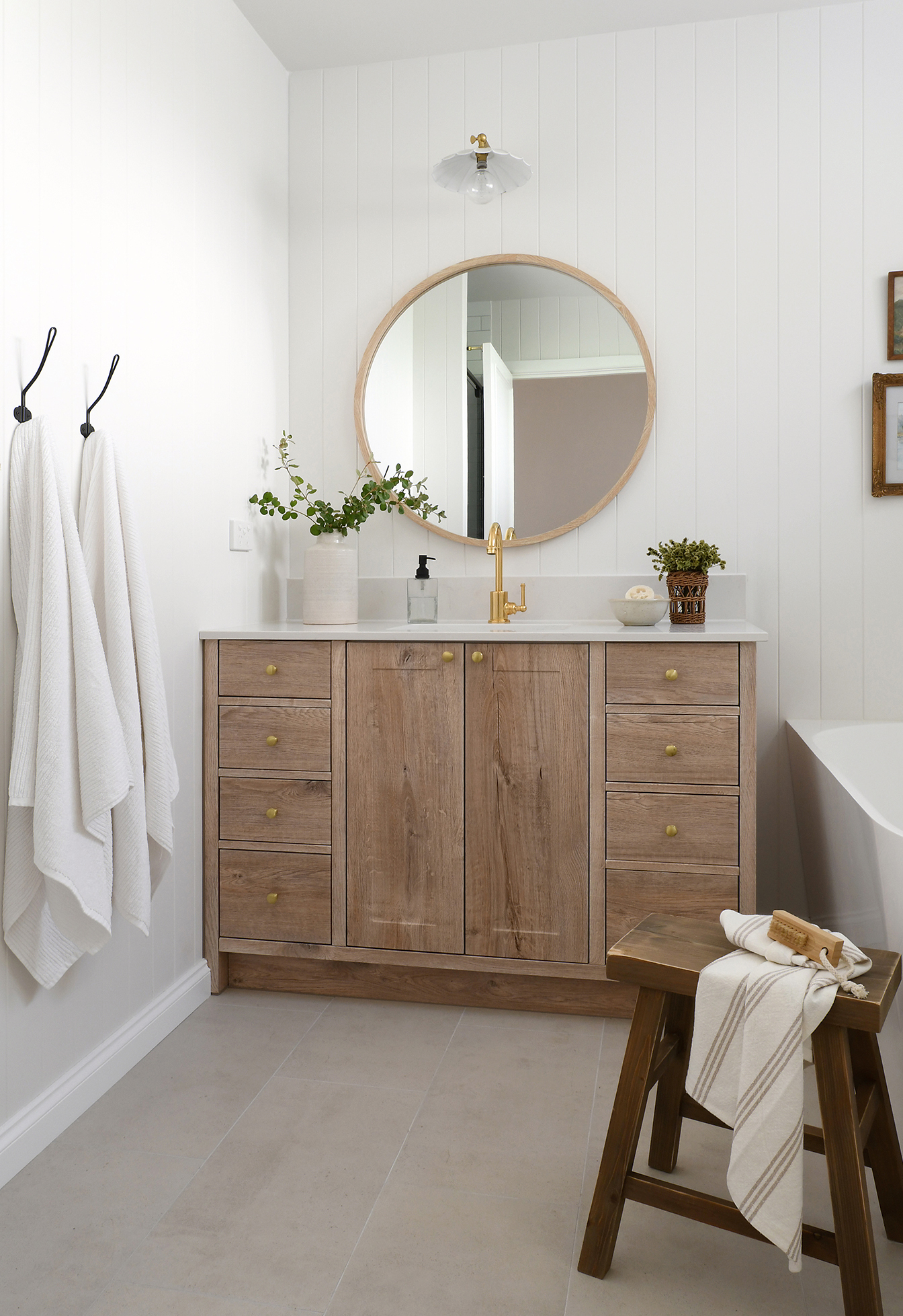
I really wanted to repurpose a vintage cabinet for the vanity, and whilst it would have saved us money, my parents weren’t keen on the idea. I ended up designing a custom piece which looks like timber though, to keep anyone from needing to sell a kidney, is actually vinyl wrapped.
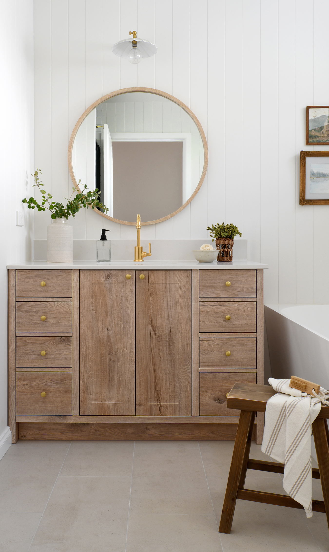

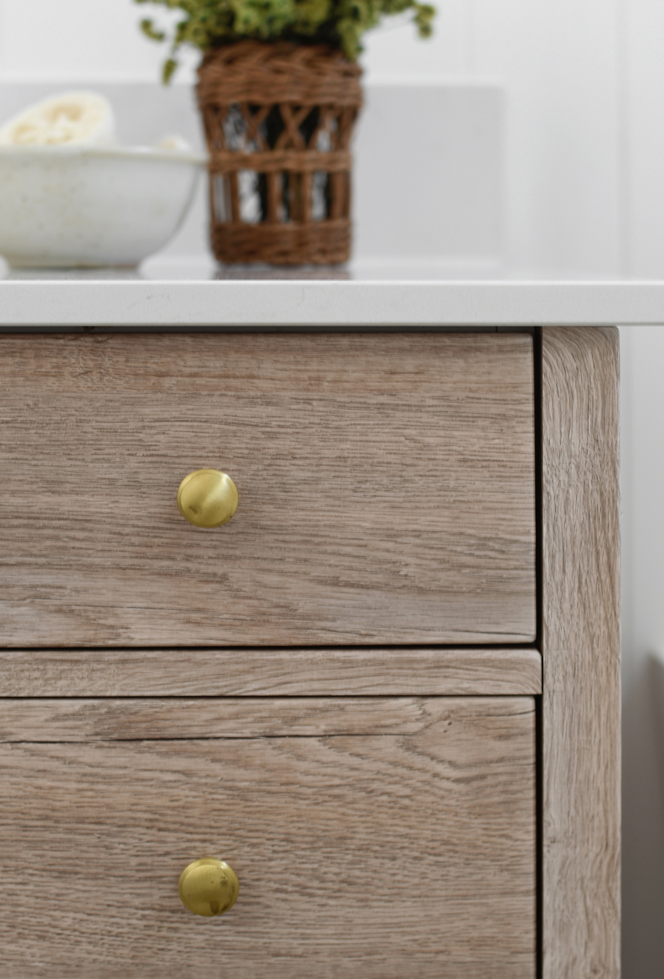

We undermounted the basin and extended the stone up the wall to create a little backsplash for a tailored finish.
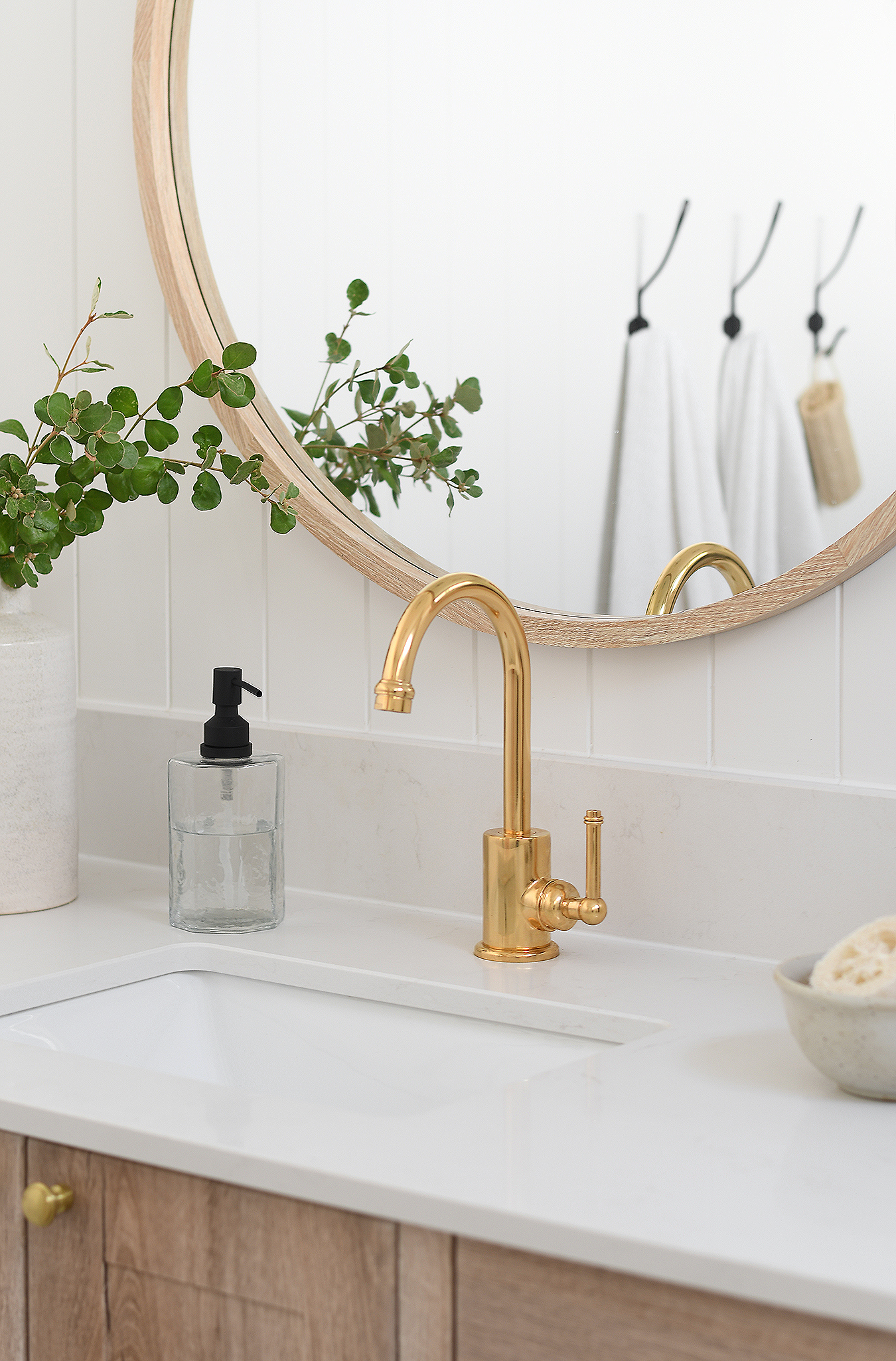

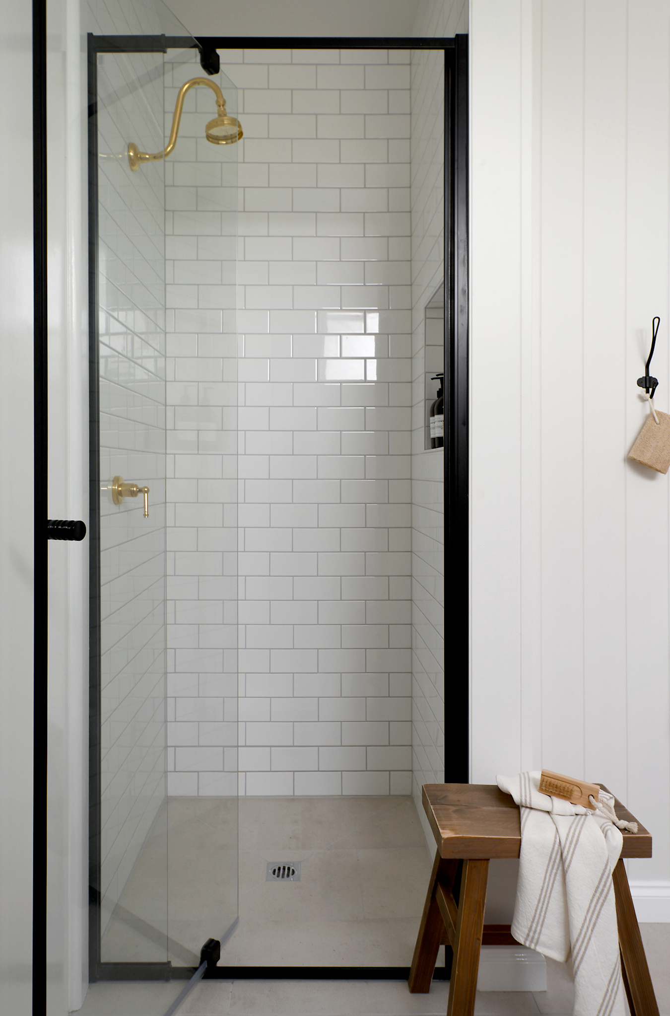
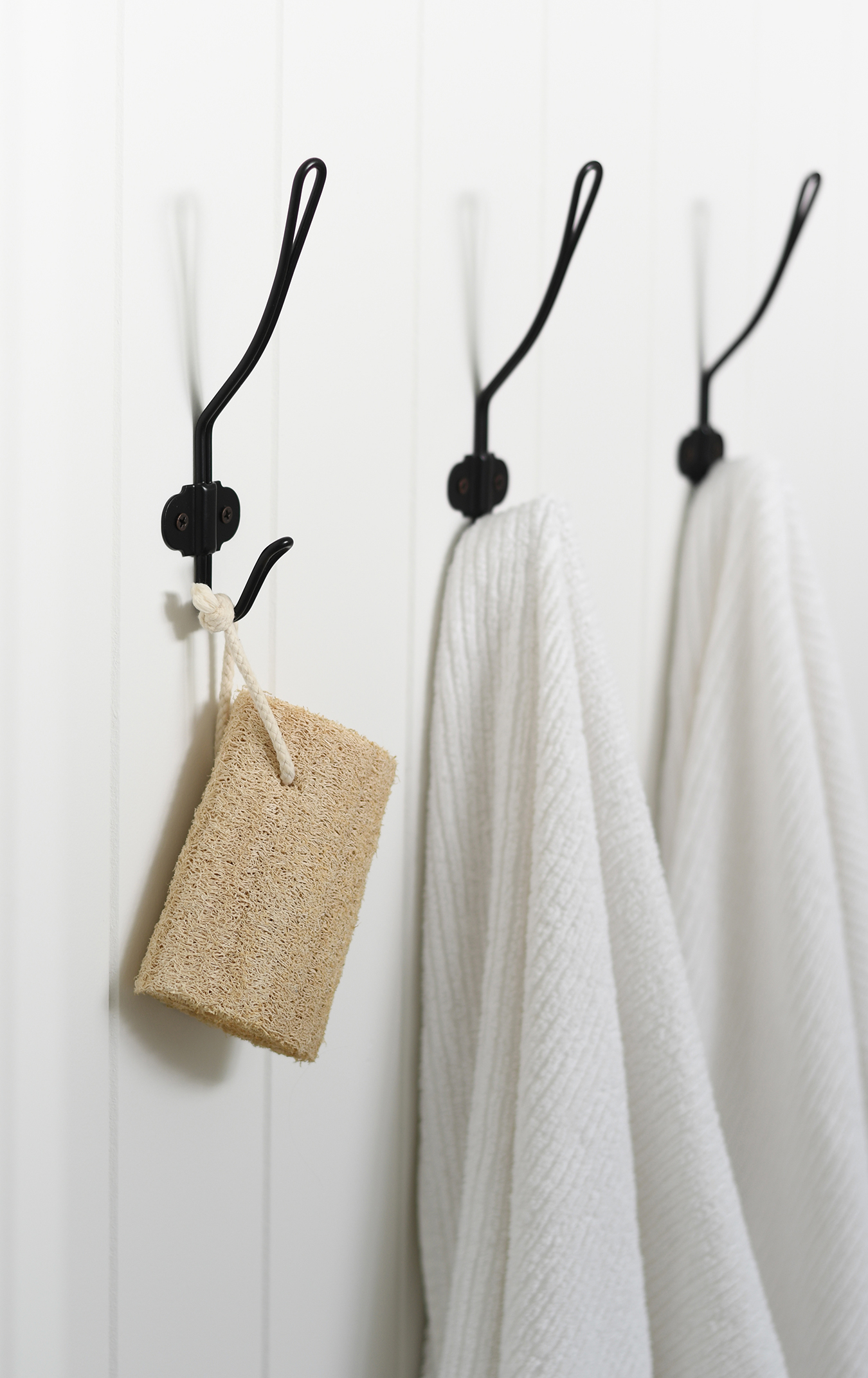
A frameless shower screen would have been nice, however it was priced at double that of a semi-frameless screen. The only frame options were chrome and black, so mum opted for black and we tied it in with the towel hooks and toilet roll holder, plus the soap pump.
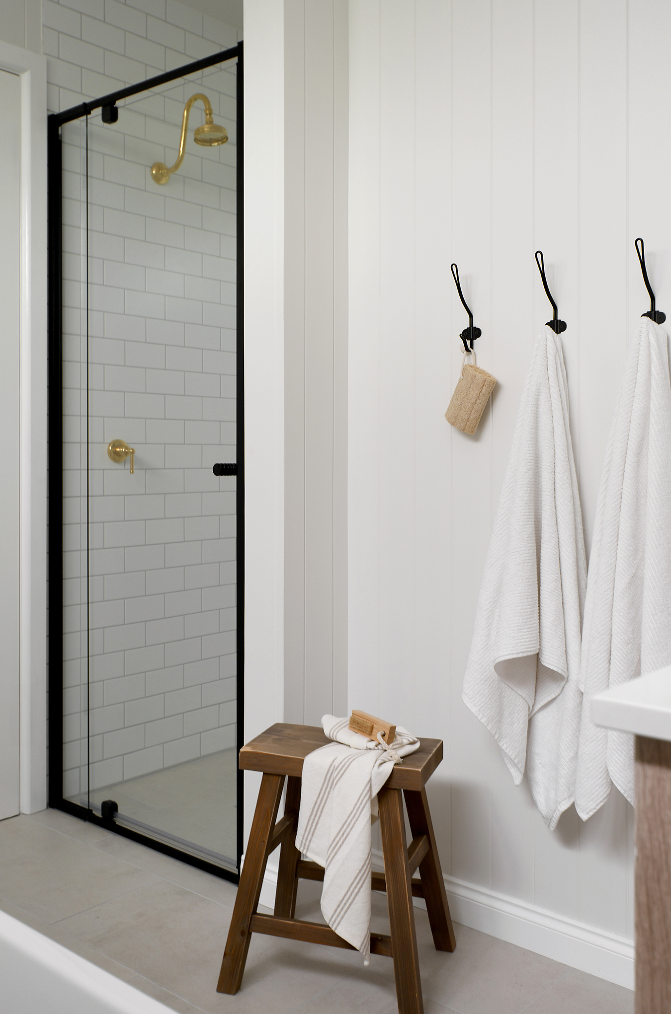

Although they are only subtle references they do work to make sense of it in the space.



My parents kept the shower tapware simple with a fixed head and mixer.
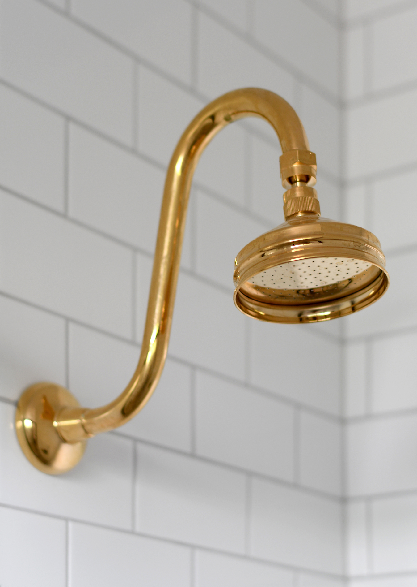

I know rail sets with hand-held pieces are practical, and popular at the moment too, though they don’t use this bathroom so they weren’t fussed.
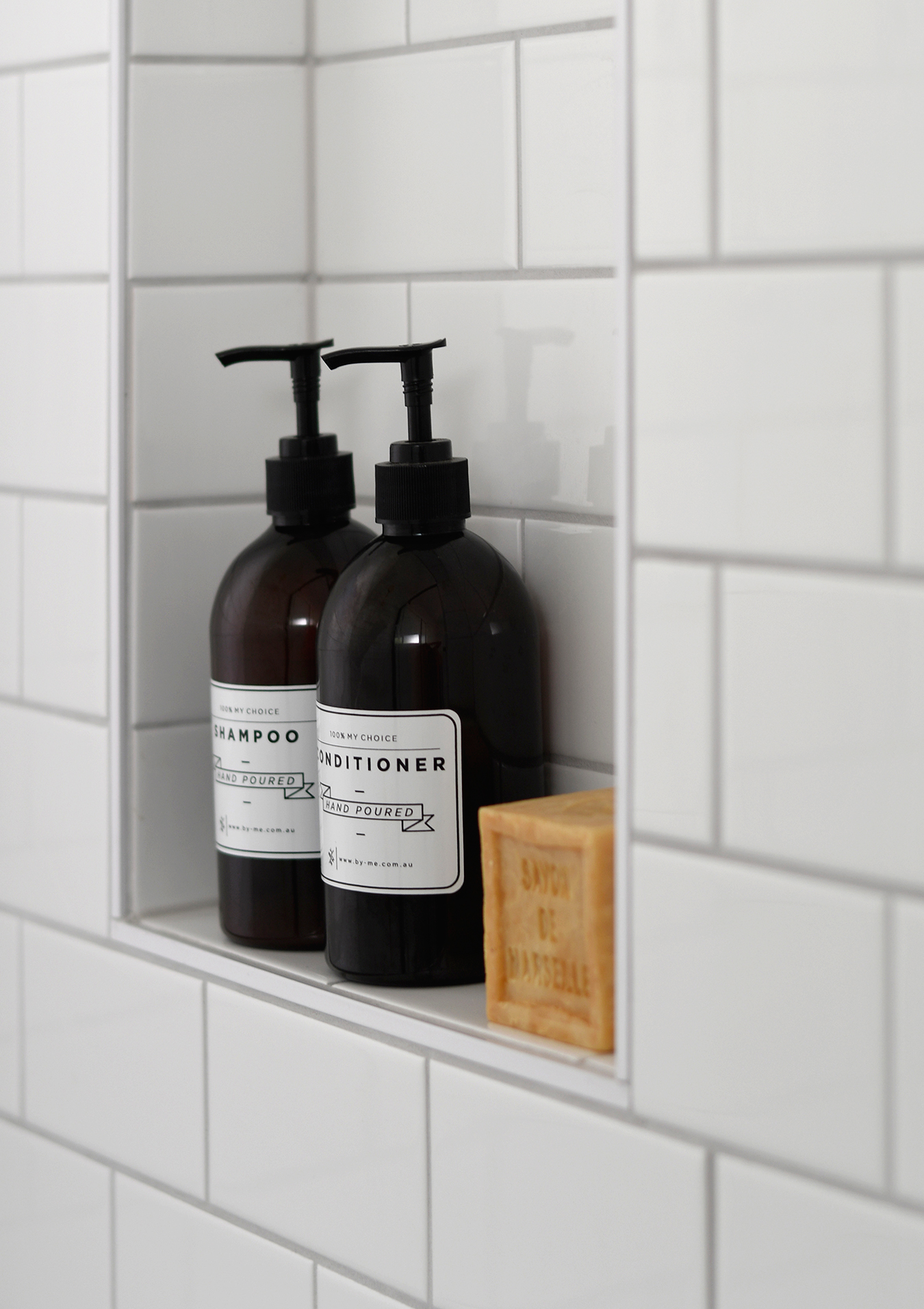
One thing they were fussed about though was adding a shower niche as previously there was nowhere to house, well, anything!

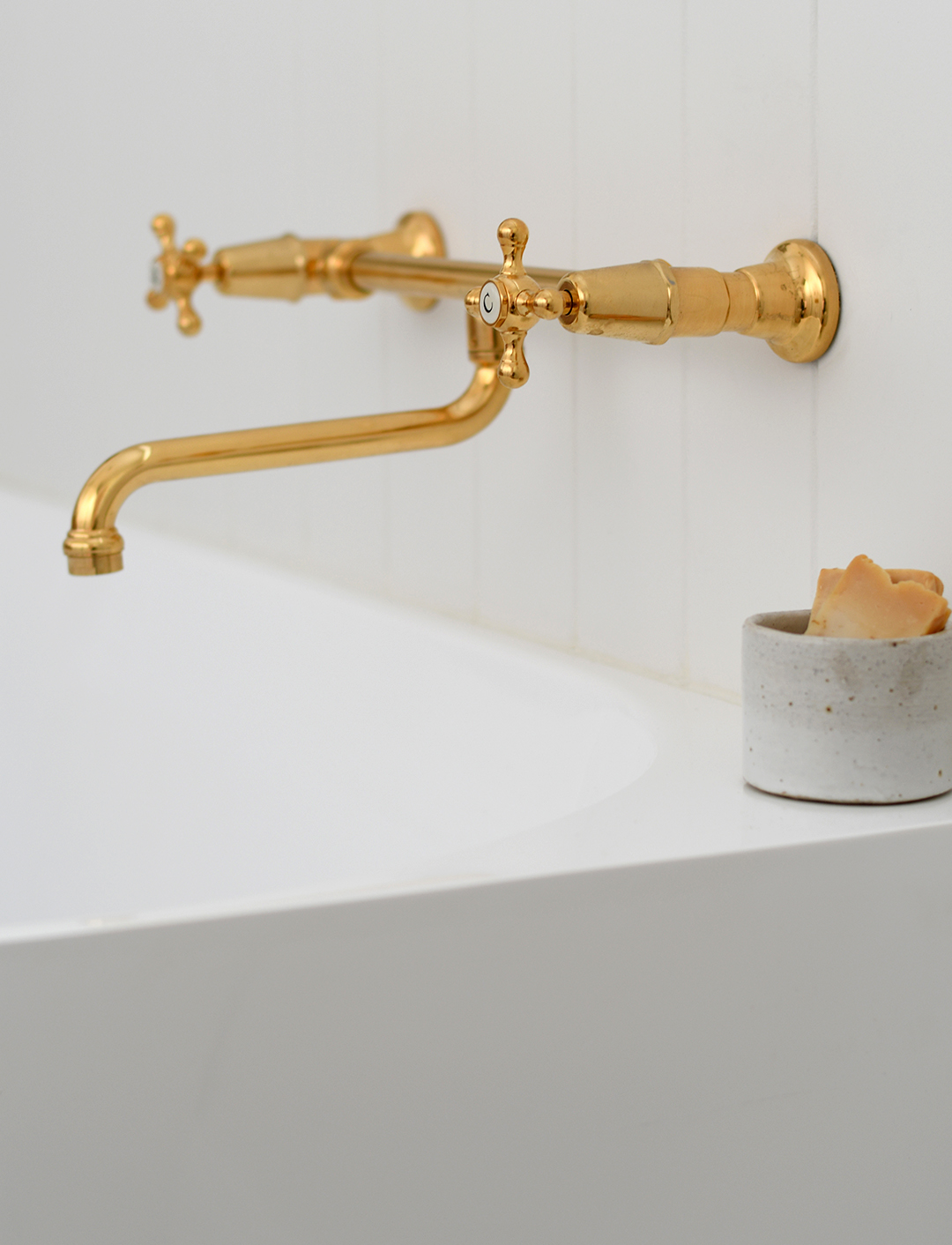
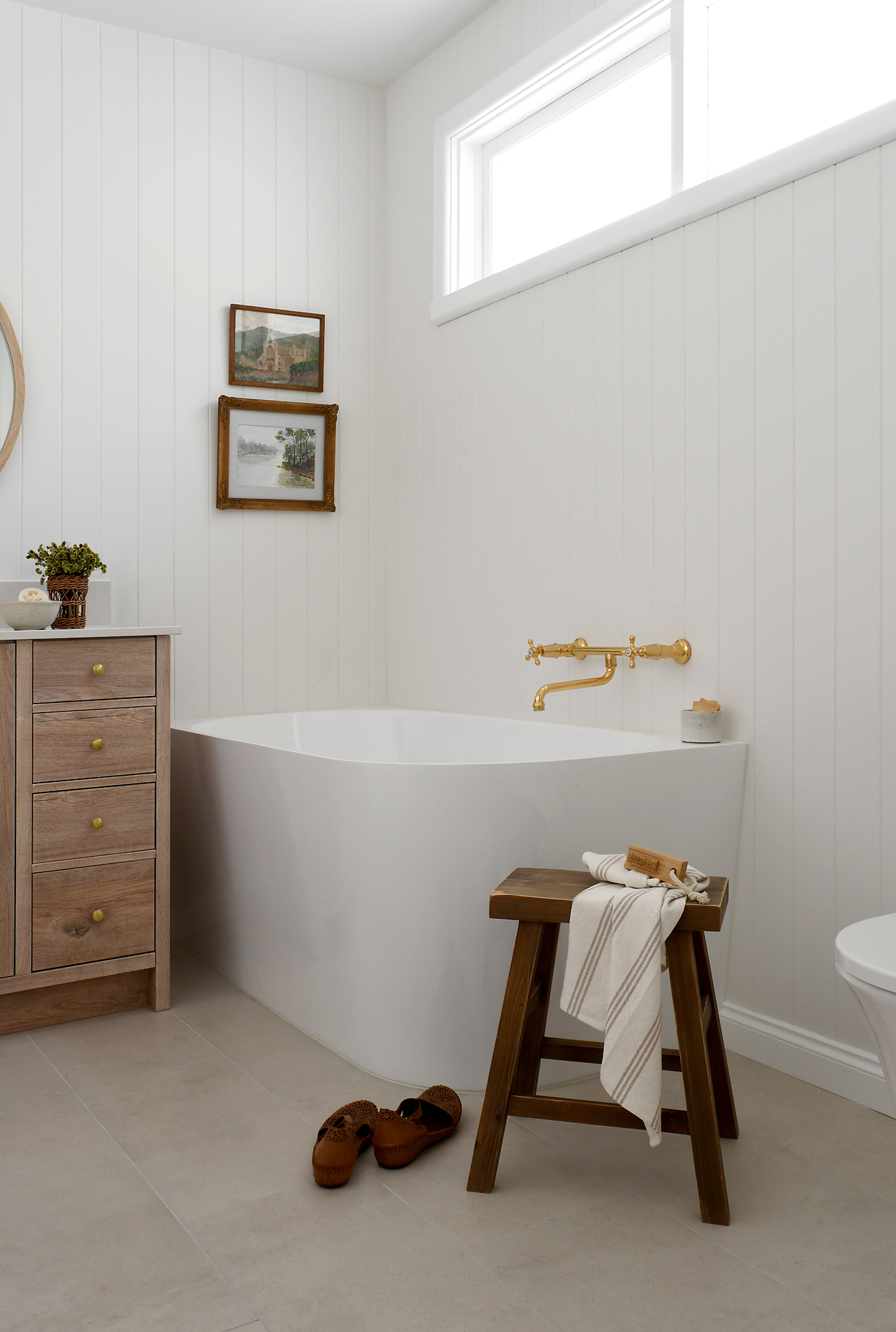
The wall mounted bath tap set is really stunning and provides instant impact upon entering the room. It’s certainly a star in the space!


Fittings like this can easily cost upwards of $1,000 though we managed to find this one for a few hundred. Still not cheap I know, though certainly not overly lavish. And how sweet is that little pottery “soap cup” (actually a candle holder) which was hand-made by my lovely sister-in-law.


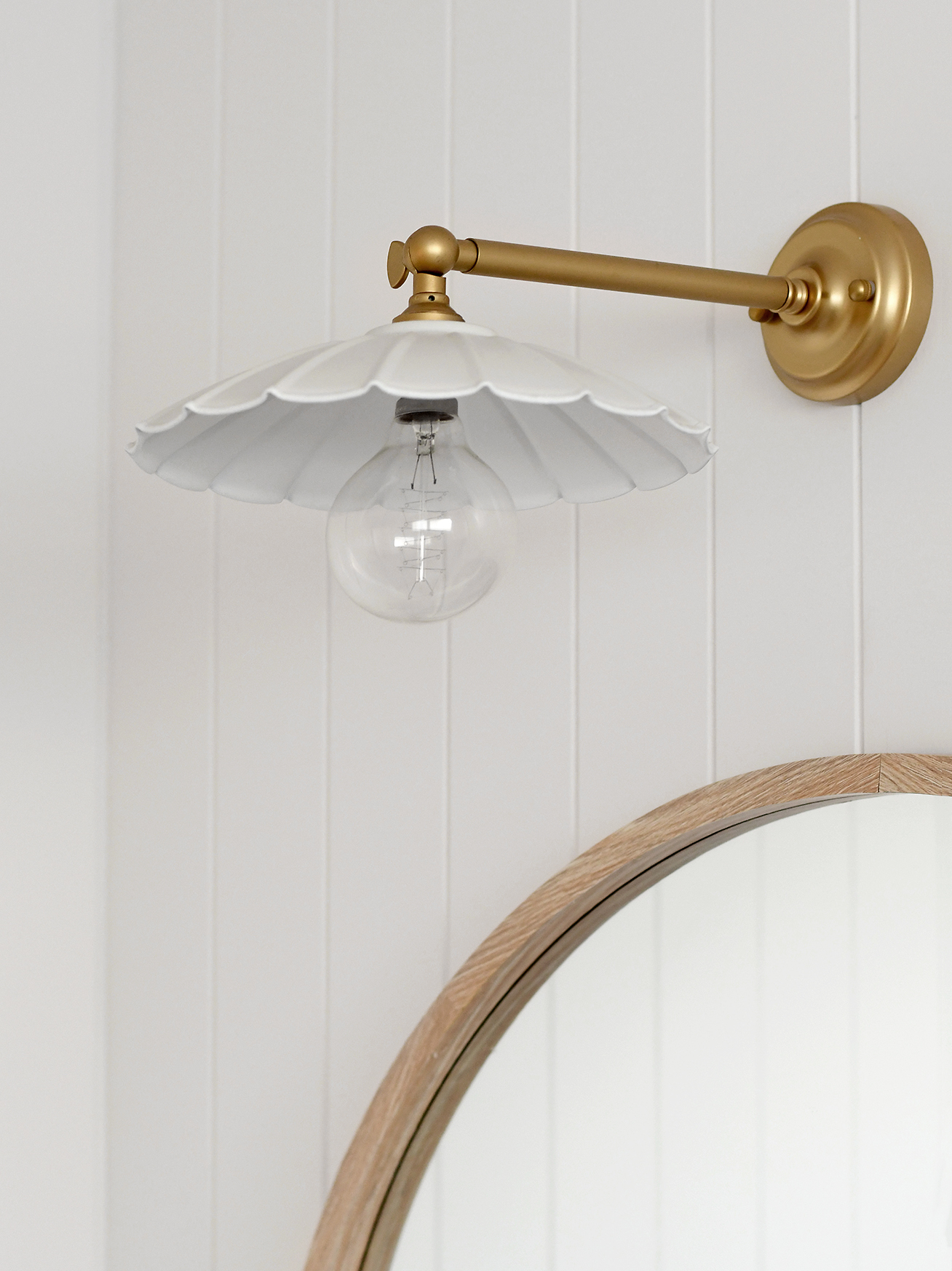
The wall light is super cute! It didn’t come with a white shade, so we simply spray painted this one.

One thing I tried, and failed, to convince my parents of was switching the hinged door to a slider (as per the layout concepts). You can see how the door opens over the shower in the reflection of the mirror below.

Although a cavity slider/pocket door couldn’t work (because of plumbing and electrical in the walls) a barn door was an option. For reasons I still don’t fully understand, my parents were adamant about retaining the door as is. Although it’s not ideal (in my opinion), one pro I vividly recall from my teenage years was being able to use the vanity when someone else was in the shower – the door acted as the perfect privacy screen! But, I’m still secretly hopeful I’ll get the barn door idea across the line one day soon.
All of the artworks are vintage pieces.
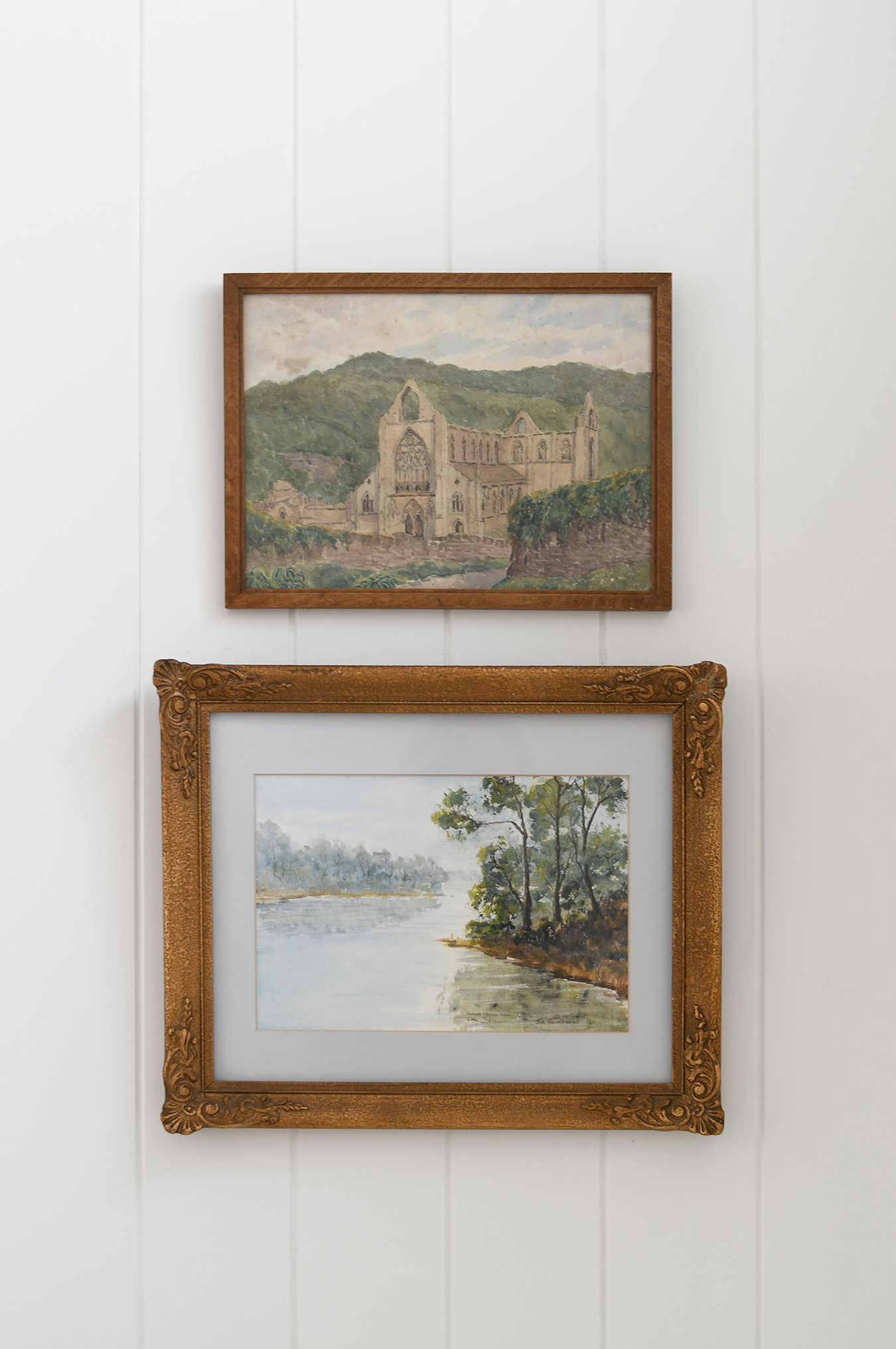

One is a thrifted find and two are originals which belonged to my gran and depict the region she lived in.


Even if it’s just to dress-up the blank space above a toilet, it never hurts to use items with meaning when decorating.


Whilst we retained the same footprint, the room now feels soooo spacious! This is mainly due to revealing more floor area. As touched on at the beginning of this post, whilst I’m well aware this newly imagined space doesn’t exude the same level of character or creativity as its former self, it was certainly the right adaptation moving forward. I hope you guys understand.
Please leave a comment and feel free to ask any questions. And don’t hesitate to reach out to me if you’d like my help bringing a space of yours to life!
ITEM SOURCES
- Floor Tile | Tivoli Urban Light Beige (300mm x 600mm)
- Shower Tile | White Gloss Subway (75mm x 150mm)
- Wall Panelling | James Hardie Groove Lining (Dulux Natural White)
- Bath | Ovia 1500mm Back to Wall Corner Bath
- Vanity | Custom (Tesrol Montana Oak Vinyl Wrap/Caesarstone Frosty Carrina)
- Vanity Tapware | Tribata Federation Basin Mixer (Brass Gold)
- Bath Tapware | Tribata Federation Wall Mounted Set (Brass Gold)
- Shower Tapware | Tribata Federation Gooseneck Head & Mixer (Brass Gold)
- Mirror | Kmart
- Wall Light | Fat Shack Vintage (shade spray painted white)
- Towel Hooks | IKEA
- Wall Art | Vintage
- Stool | Spotlight
- Lotion Bottles | Labels from ‘By Me’
