Hi Friends. Well look at that – we’re halfway through April. Turns out, I’m not so great at designing an entire house from top to bottom (and doing it all from 1200 miles away) and blogging about it simultaneously, especially when you toss in pandemic parenting, the continuation of endless cooking and cleaning and attempting to take care of myself on occasion. There just aren’t enough hours in the day and I cannot burn the midnight oil the way I once did (thanks 40’s). As a result, this little ole blog is just getting neglected. For that, I ask your forgiveness.
To make it up to you, I’m bringing you an insane amount of design inspiration over the coming days with a series of home tours and interviews that have been informing my design choices at the Hood Canal Cottage (and admittedly making me want to switch a bunch up at This Old Victorian as well).
For those dying for Hood Canal Cottage updates, I am sharing a bunch of major sneak peeks on Instagram this week. Even though I have a love/hate/love relationship with Instagram these days, for some reason, it just feels easier to give quick updates there – so if you don’t already follow, please do pop over to Instagram if you want to see the Hood Canal Cottage mid-construction.
Now, let’s dive into a truly stunning home tour as a little palette cleanser for your week.
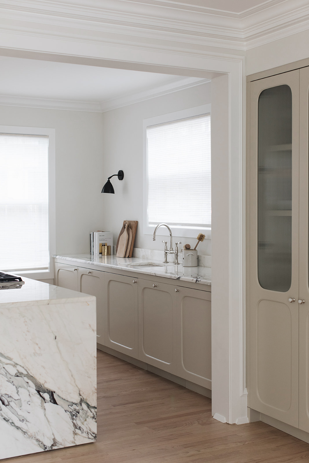
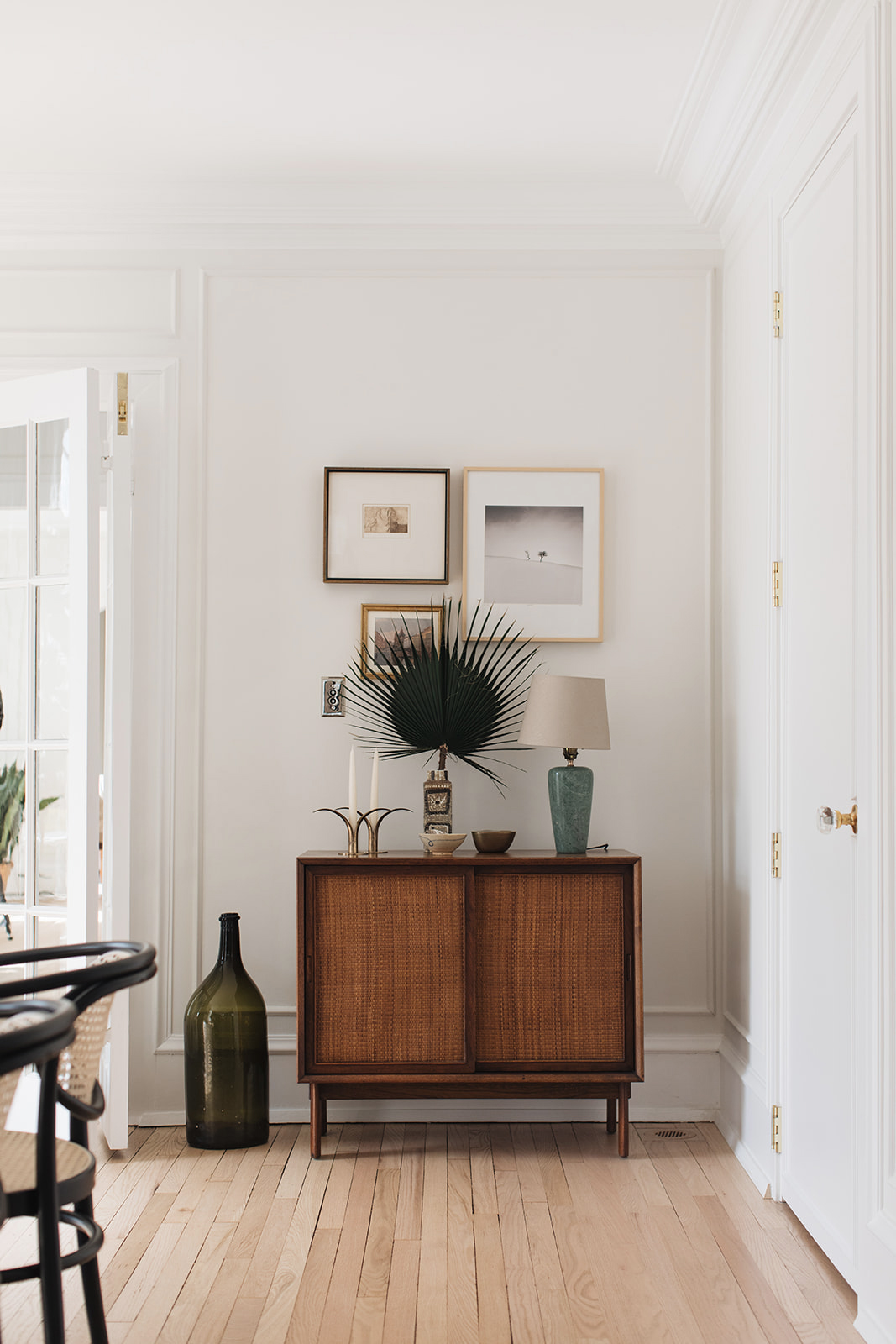
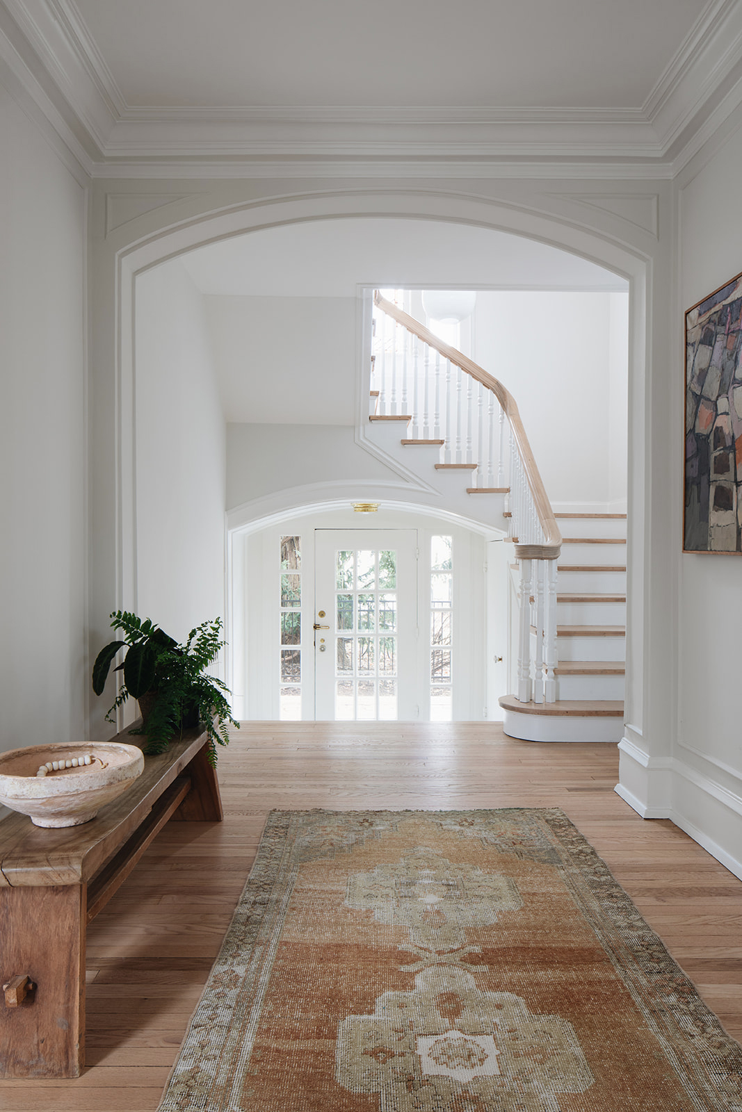
This home is designed by Pernille Lind, one of my favorite design studios. Based in London, Pernille expertly combines modern and traditional styles to create warm, inviting spaces that just draw you in. This project is a perfect example. At first glance, you might make you think this is a stately home somewhere in the UK, but it’s actually a Colonial Revival home in Chicago. The beautiful mix of design styles and materials immediately caught my eye. It shows how you don’t have to stick to a “modern” or bohemian or antique look, no matter the architectural style of your space.
Keep scrolling for a closer look and for my interview with Pernille about her process!
What was the project scope and how long did it take?
I flew over to see the house just when the client had gotten the keys in May 2018. We then found a local architect to help with the planning permissions and a contractor for the renovations. The construction crew started on site in October 2018. I regularly went over to attend meetings to appoint local cabinet makers for our bespoke kitchen and joinery, as well as oversee some of the build process and key material selections with the client. The client could then move in August 2019, where I flew over to install all of the main furniture, as well as sourcing smaller items, such as unique vintage pieces and art. These we spent a while finding in local shops and markets. We added in an additional trip beginning of 2020, as some items still needed sourcing and we could then photograph the project.
What sources do you use for inspiration?
For every project, I always look at the architecture of the building and interior spaces, its character, light, and period features. This informs the direction of the interior experience and the key notes to play on. Generally, I’ll look for inspiration through a variety of artistic mediums, however, materiality and color seem to be the first steps I take when getting to grips with the concept of a new project.
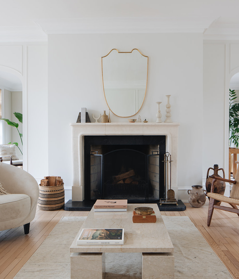
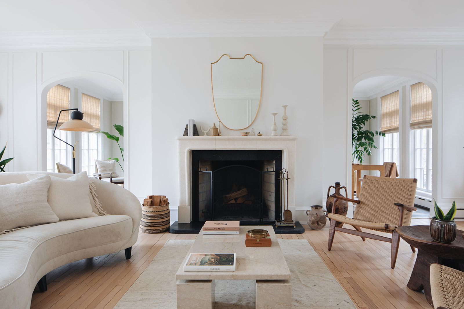
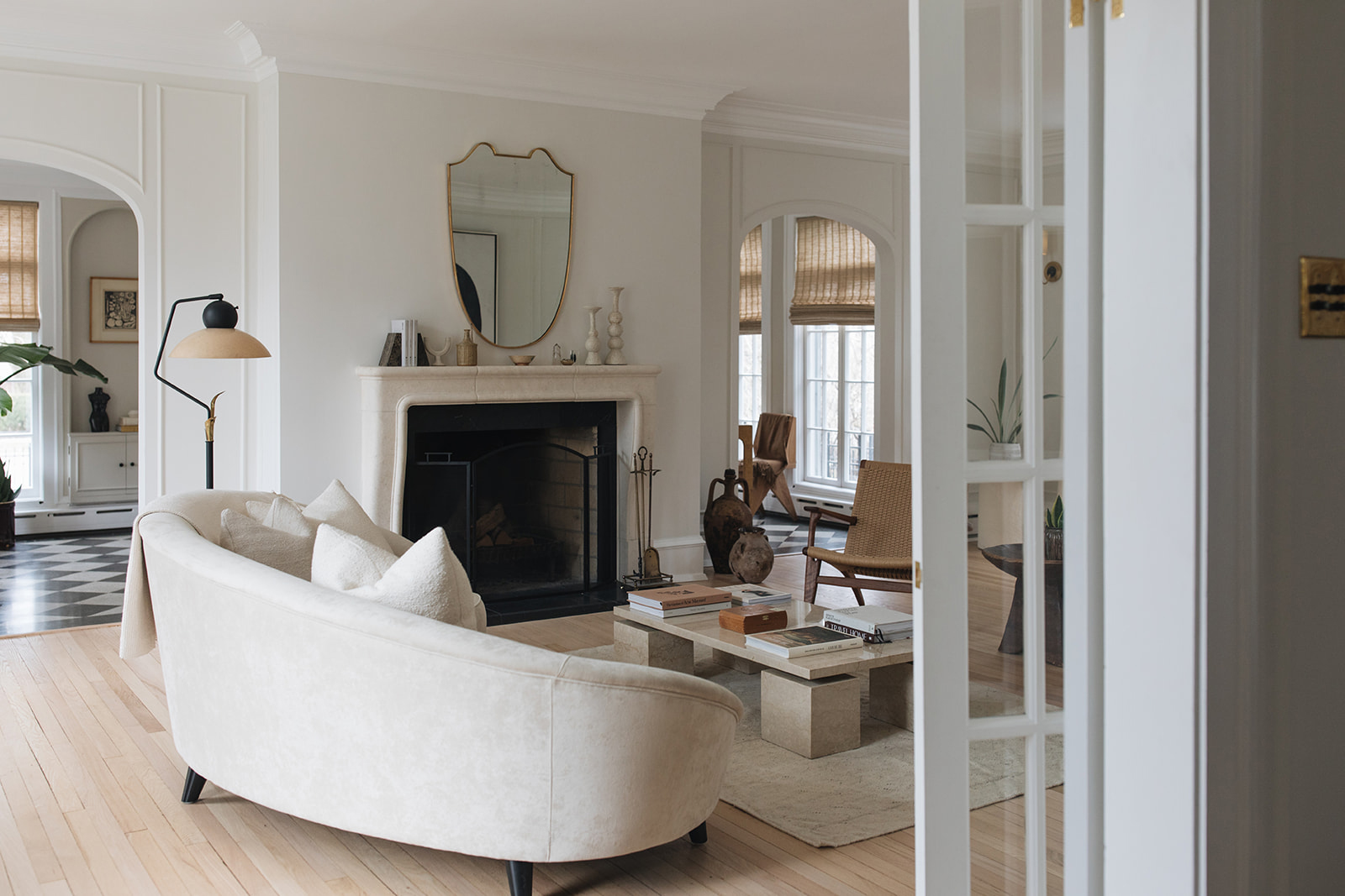
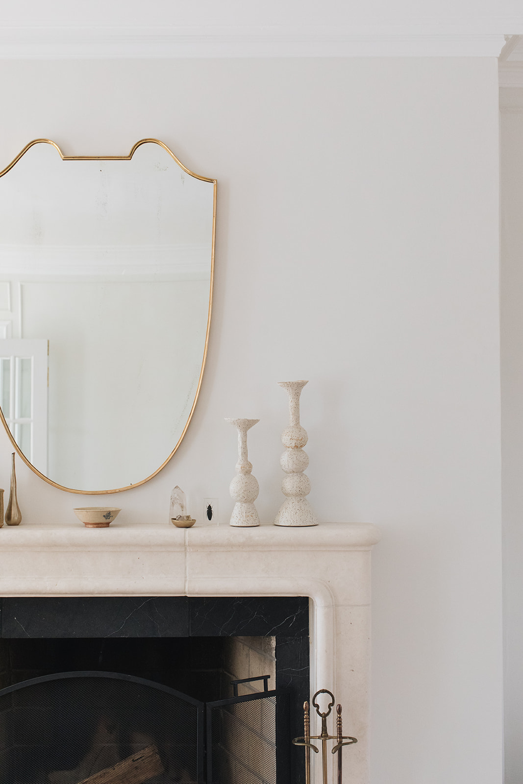
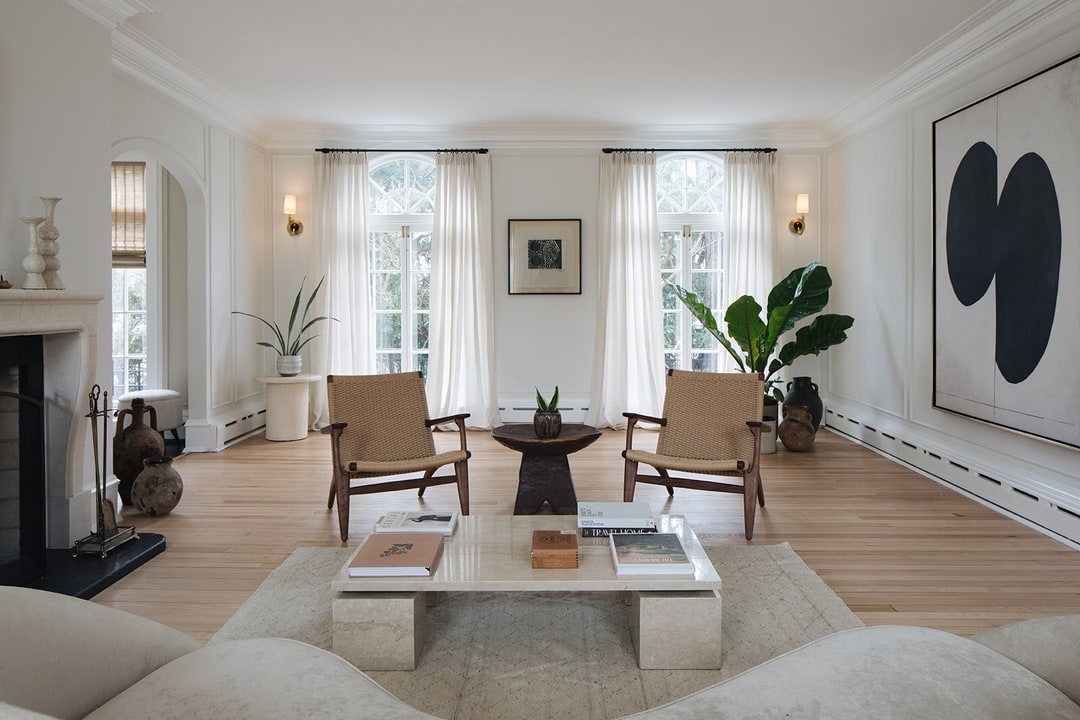
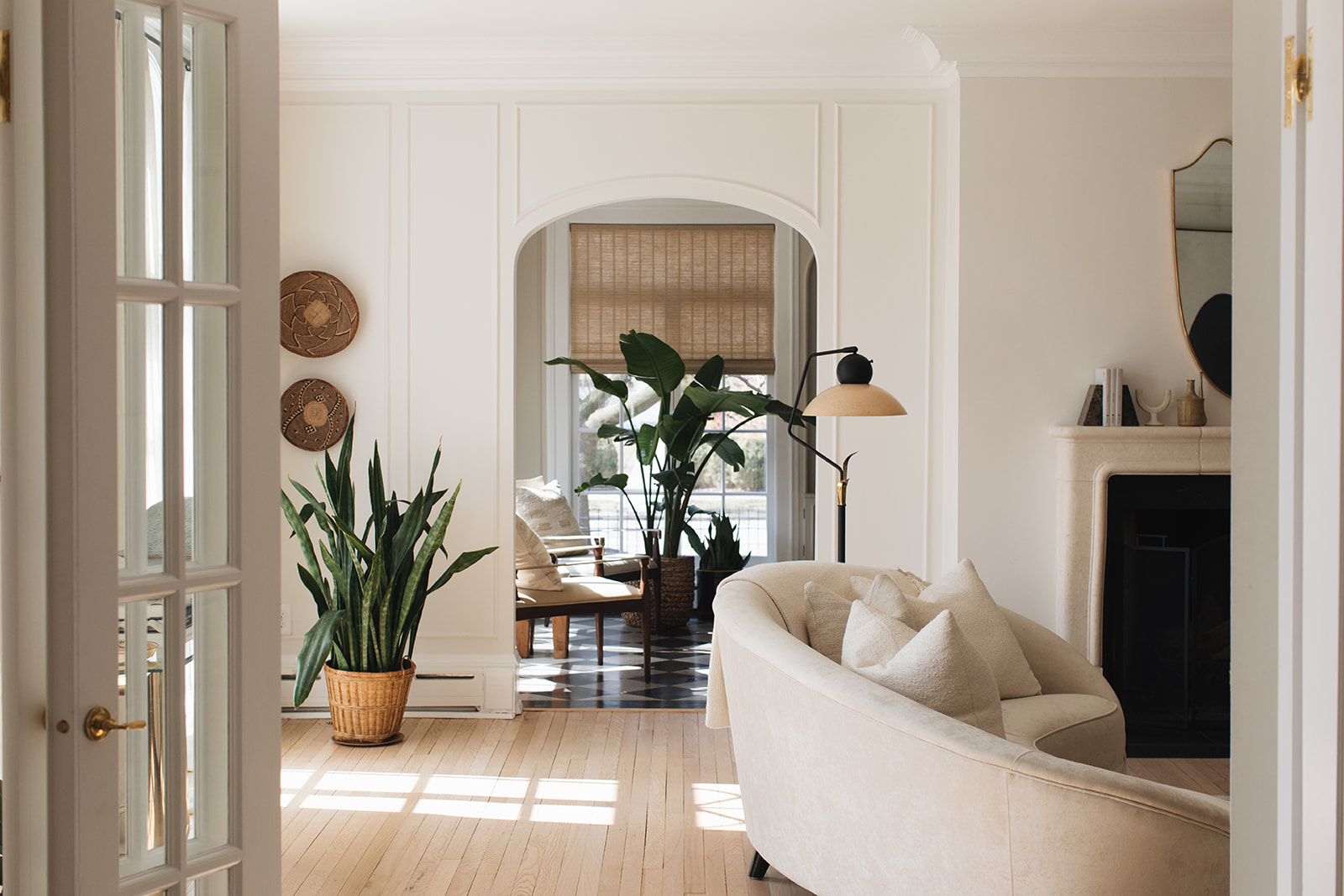
In the living room, we have a curved sofa from Eichholtz and two Carl Hansen CH25 armchairs in oiled walnut and natural cord. We found a striking vintage Italian travertine marble table from local antique shop South Loop Loft along with the brass Italian mirror over the fireplace. The black metal and fiberglass floor lamp is also from a local vintage store ‘Salvage One’. This piece really steals the show in the room, and unfortunately, the seller didn’t have much information about the origins of the light, I would expect it’s 1950’s.
The living room is the home’s gem. Late in the afternoon, the sun light reflects the long shadows of the palladium windows across the floor. It’s very dramatic and creates this additional visual layer to the room.
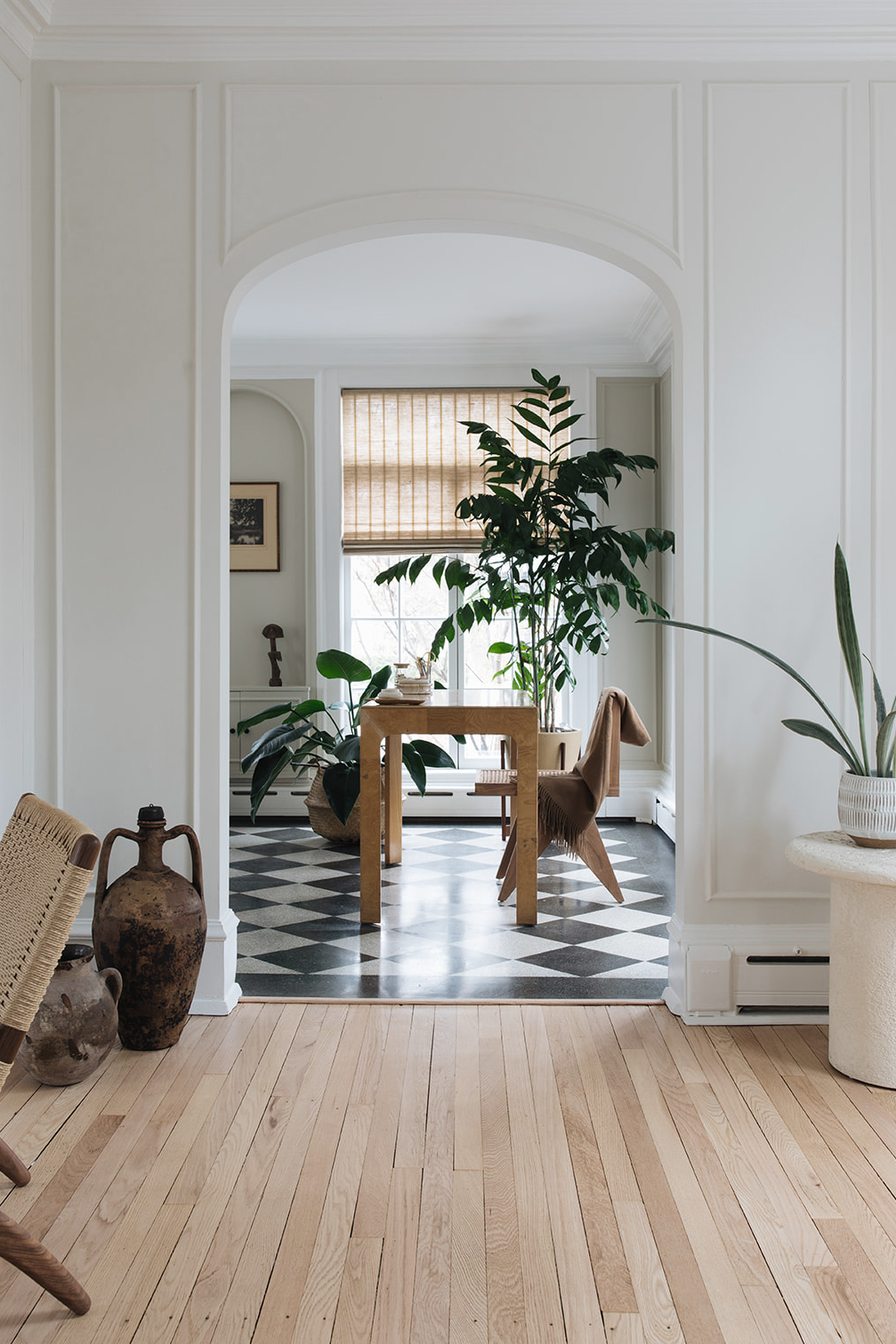
In the sunroom office, we sourced a desk chair from Jayson Home in oak and cane, paired with a vintage Scene Two olive burl-wood Parsons-style desk from Henredon. The wall colour is Farrow & Ball 201 ‘Shaded White.’
How did you work with the client on creating the vision?
The client’s brief was to create calm and natural surroundings, as well as incorporate an essence of their many years of living in Europe and world travels. Moreover, they were looking for a considered approach to creating a functional home for a modern family with a love of entertaining and having friends and family over.
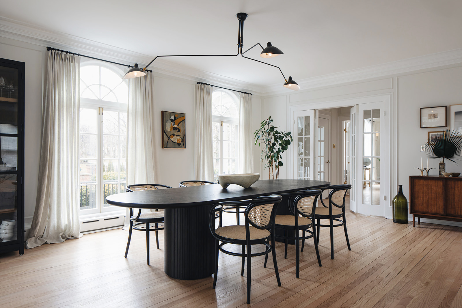
The house has abundant daylight and great period features, such as the arched palladium windows, frame molding and European style cornicing. I, therefore, kept the color palette muted and soft, in order to let the architectural features be the main heroes of the spaces, and key to the clients brief – achieve a calm atmosphere only punctuated by a few contrasting furniture pieces, such as the black stained dining table and dark wood vintage pieces.
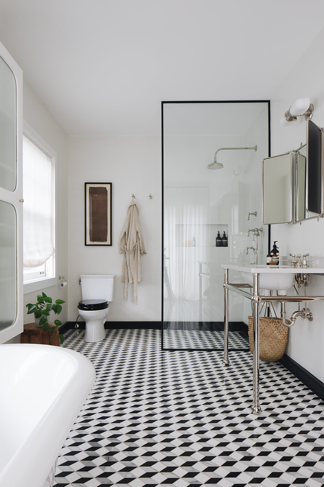
To achieve a more modern living style, I opened up the kitchen and dining spaces on the ground floor, and further created a luxurious master bedroom en-suite, by converting a walk-in wardrobe with an existing bathroom. I then located the dressing room within an adjacent bedroom and added a connecting door to the master bedroom.
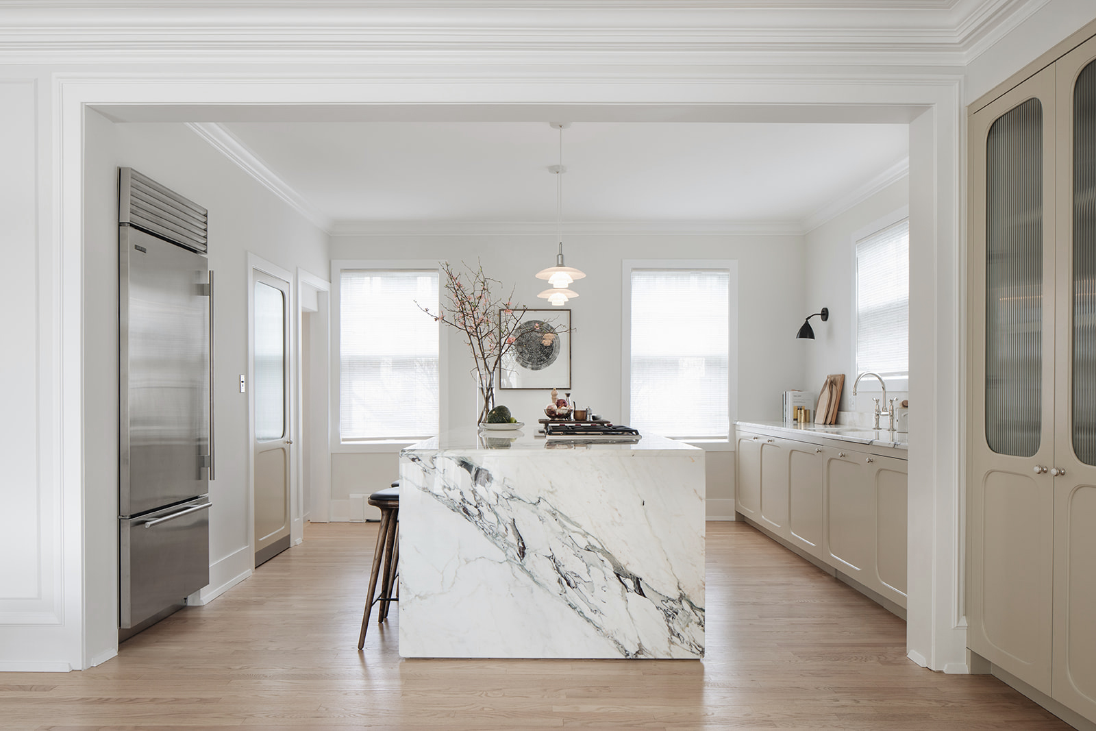
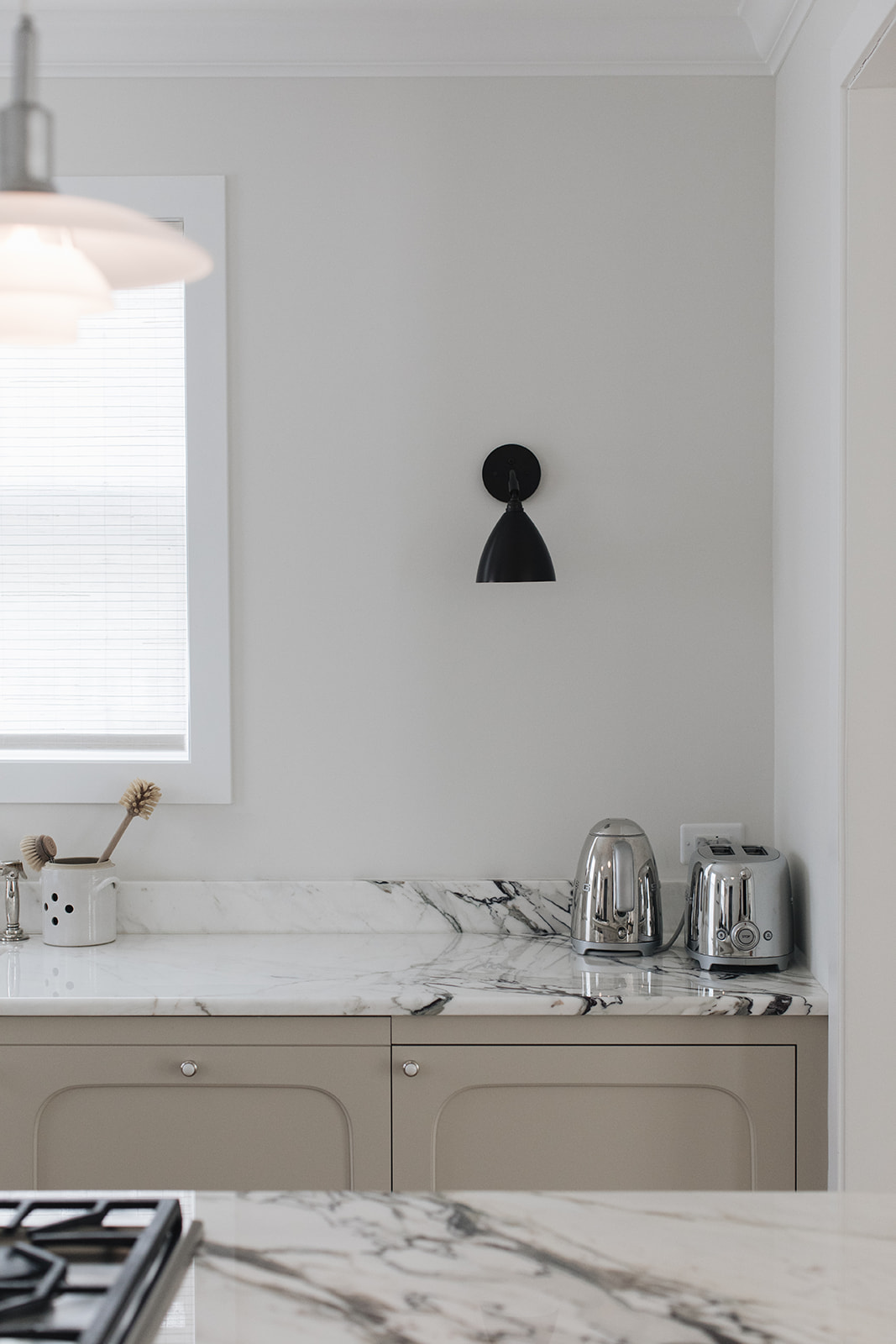
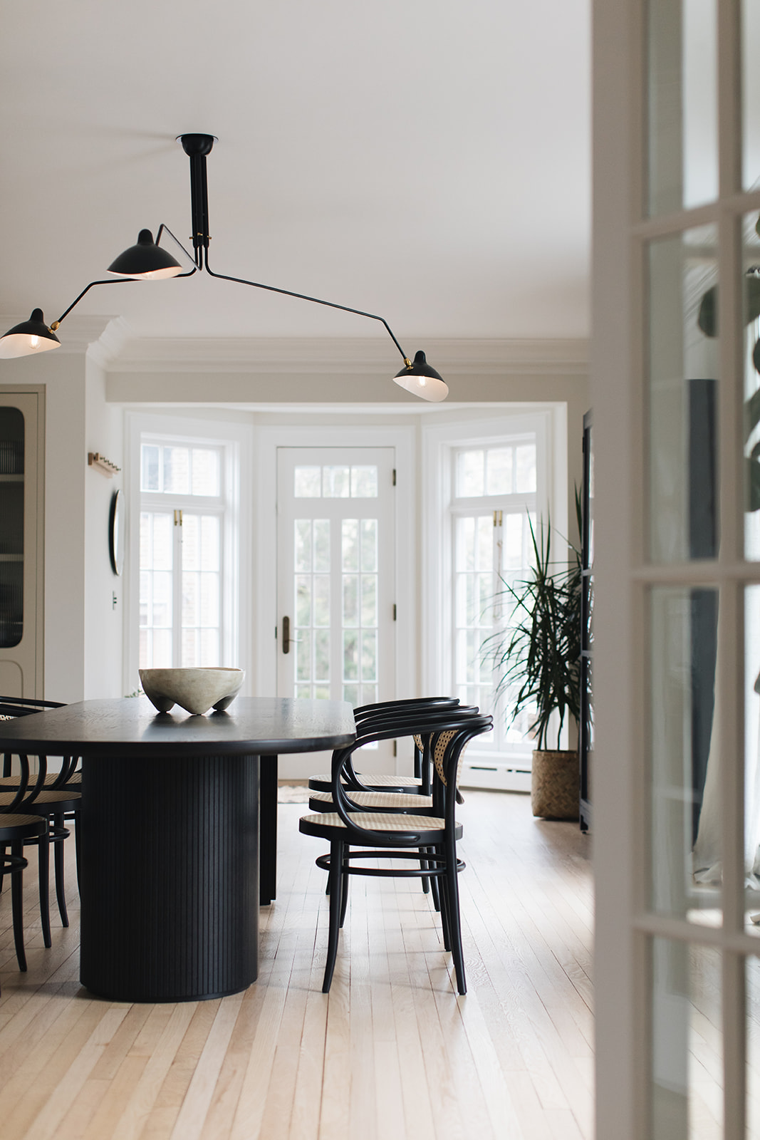
In the kitchen and dining area, the dining table is from Gubi called ‘Moon’ table with wicker and black painted bentwood dining chairs from Thonet. The pendant is a new production 3-arm Serge Mouille light. Over in the kitchen island, we chose PH 3/2 Pendant lamps by Louis Poulsen over the island and Bestlite BL7 wall lights by Gubi over the kitchen counter.
Renovating old homes always comes with surprises. Where there any in this project?
The house has only had 4 owners in its lifetime. The current owners are the 5th. In the process of the renovation, they came across many interesting relics. As they were replacing some damaged floorboards in the attic level, they uncovered a metal plate (secured with brass tacks) that was patching a hole. Upon closer look, the plate was an old cracker tin that had been cut and flattened out – it read “National Biscuit Company.” The company is today known as Nabisco, and they think the tin dates back to sometime before 1928.
They also uncovered interesting historical features in the home such as a basement coal chute and coal room with a slanted floor, a root cellar that stays cool all year round (it was converted to a wine storage space), and a separate maids’ stairwell and maids’ quarters.
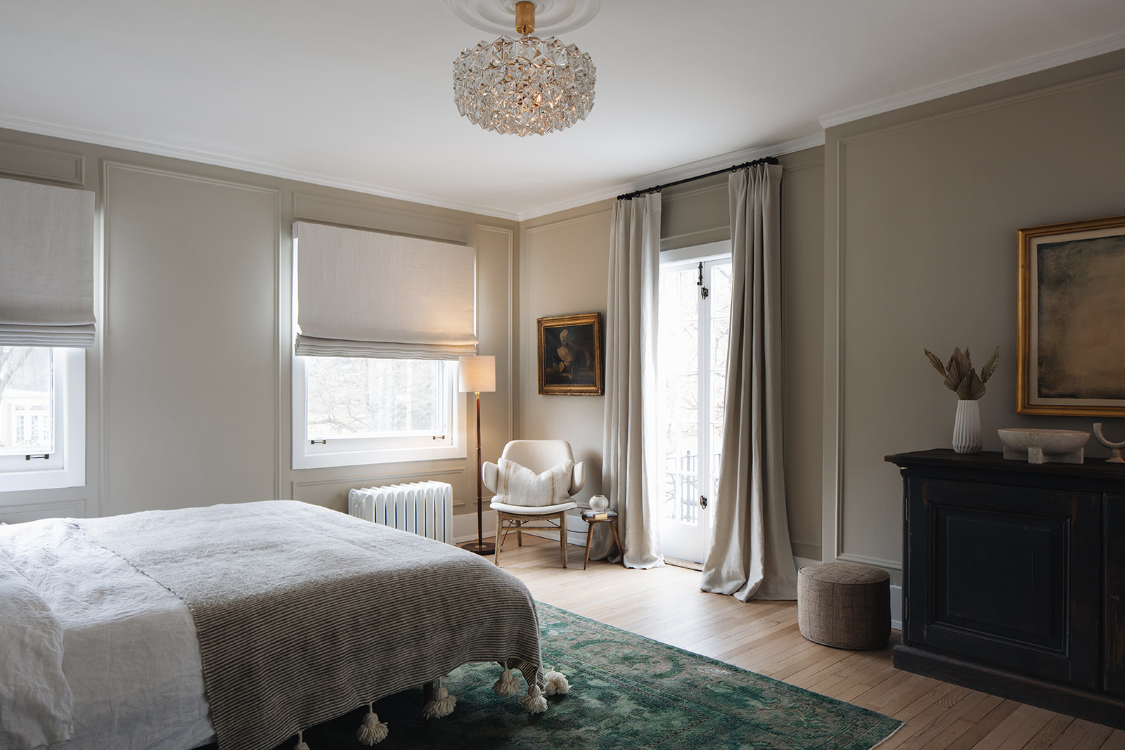
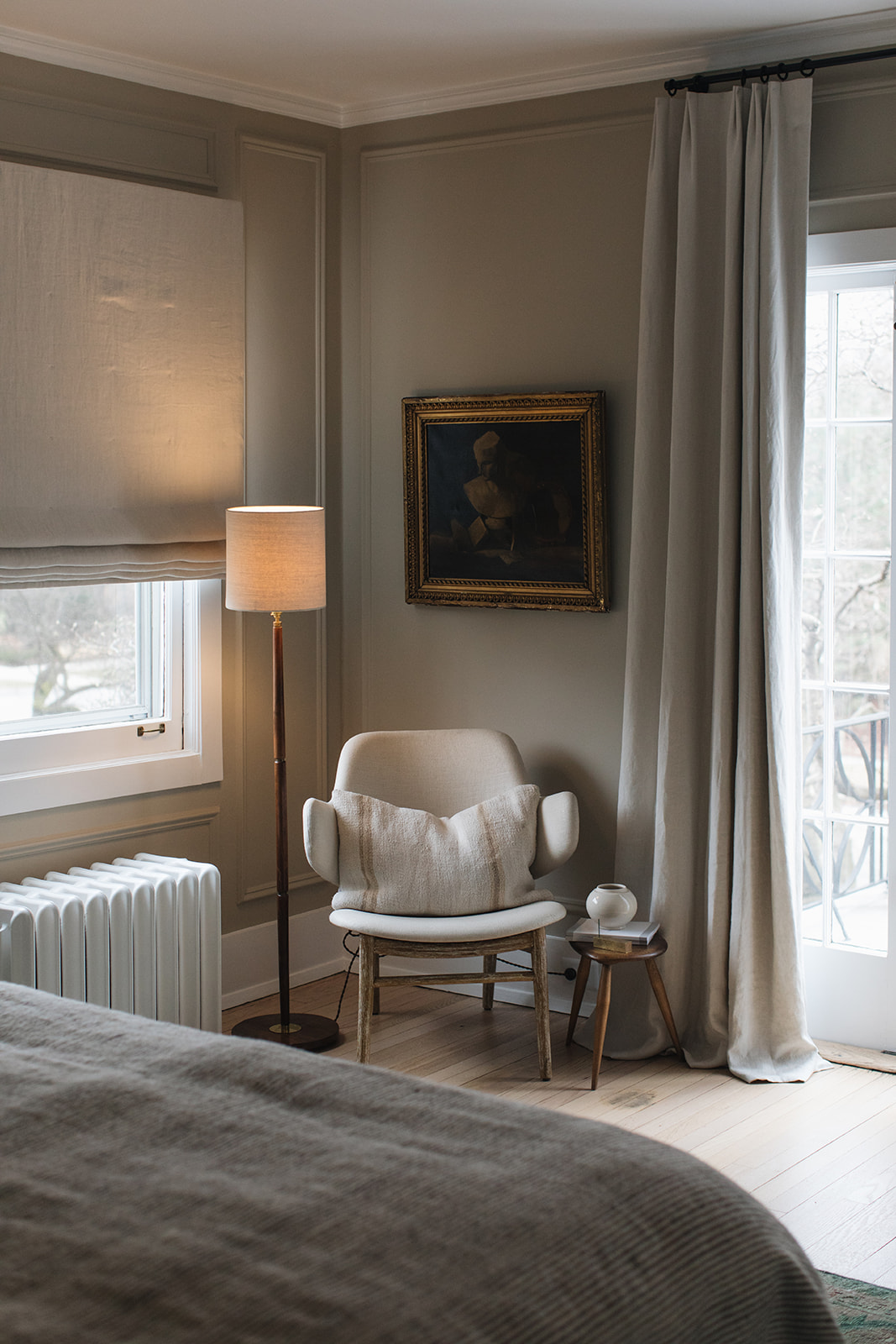
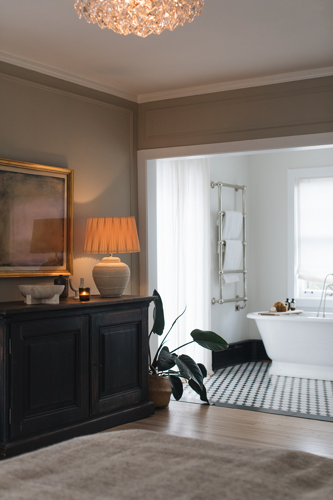
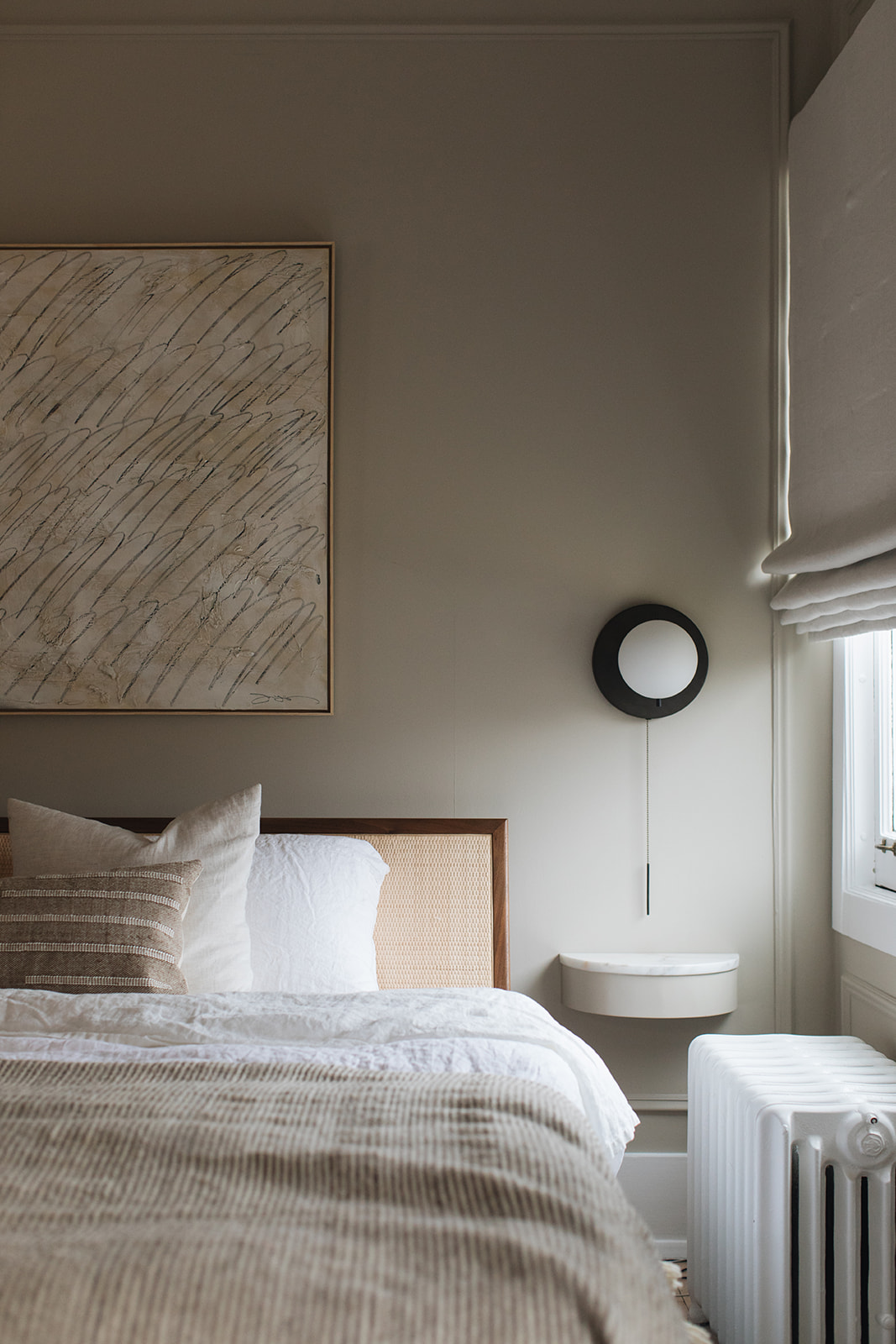
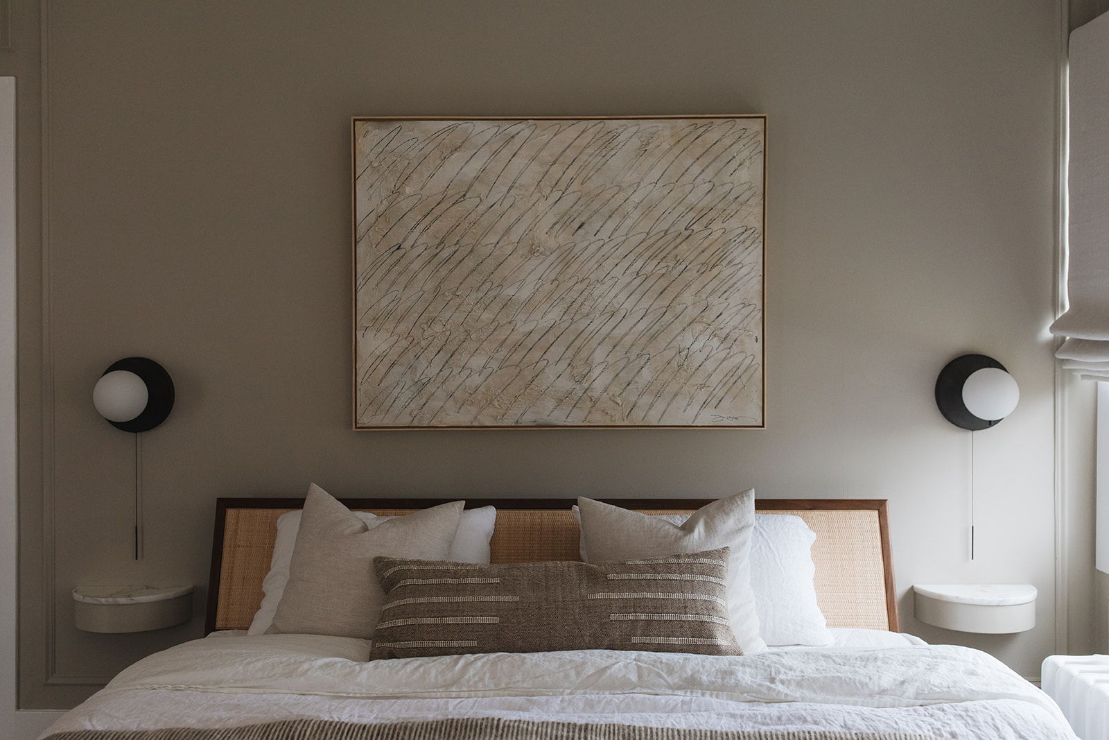
In the master bedroom, the bed is the Nelson Thin Edge Bed by Herman Miller with a vintage four-tiered, gold-plated Kinkeldey chandelier from the 1960s. The artwork above the bed is by Josh Yöung. The bedside wall lights are Signal Sconce in bronze, by Workstead. The wall color is Farrow & Ball 211 ‘Stony Ground.’
To see more home tours, CLICK HERE.
design by pernille lind studio, photography by john and maura stoffer

