Last night, I was thinking about how much my readers have influenced the design decisions I’ve made for our house. It’s really pretty amazing the amount of input I get from readers, but beyond that, it’s amazing how talented some of you are. Some of you clearly have talent and expertise in areas that I don’t, and it’s been amazing to get that input and actually put it into motion (or have plans to put those plans into motion in the near future). Here are three areas that readers have influenced just in the last couple of months.
Kitchen and Walk-Through Pantry
I was really struggling with the whole kitchen idea. I knew I wanted a new kitchen, and I wanted to move the kitchen, but the only thing I could come up with was to add on a new kitchen. After playing around with several ideas, this was the best I could come up with…
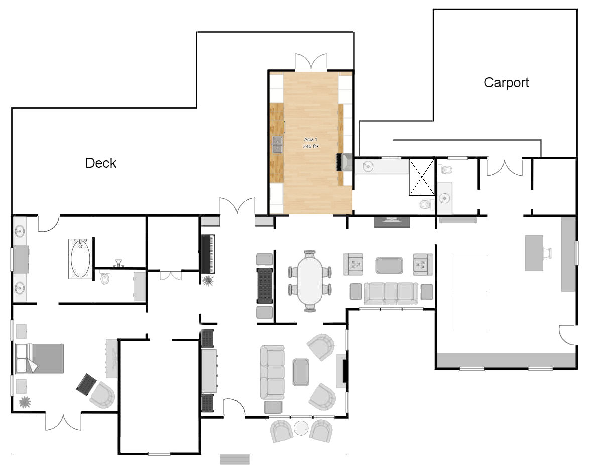

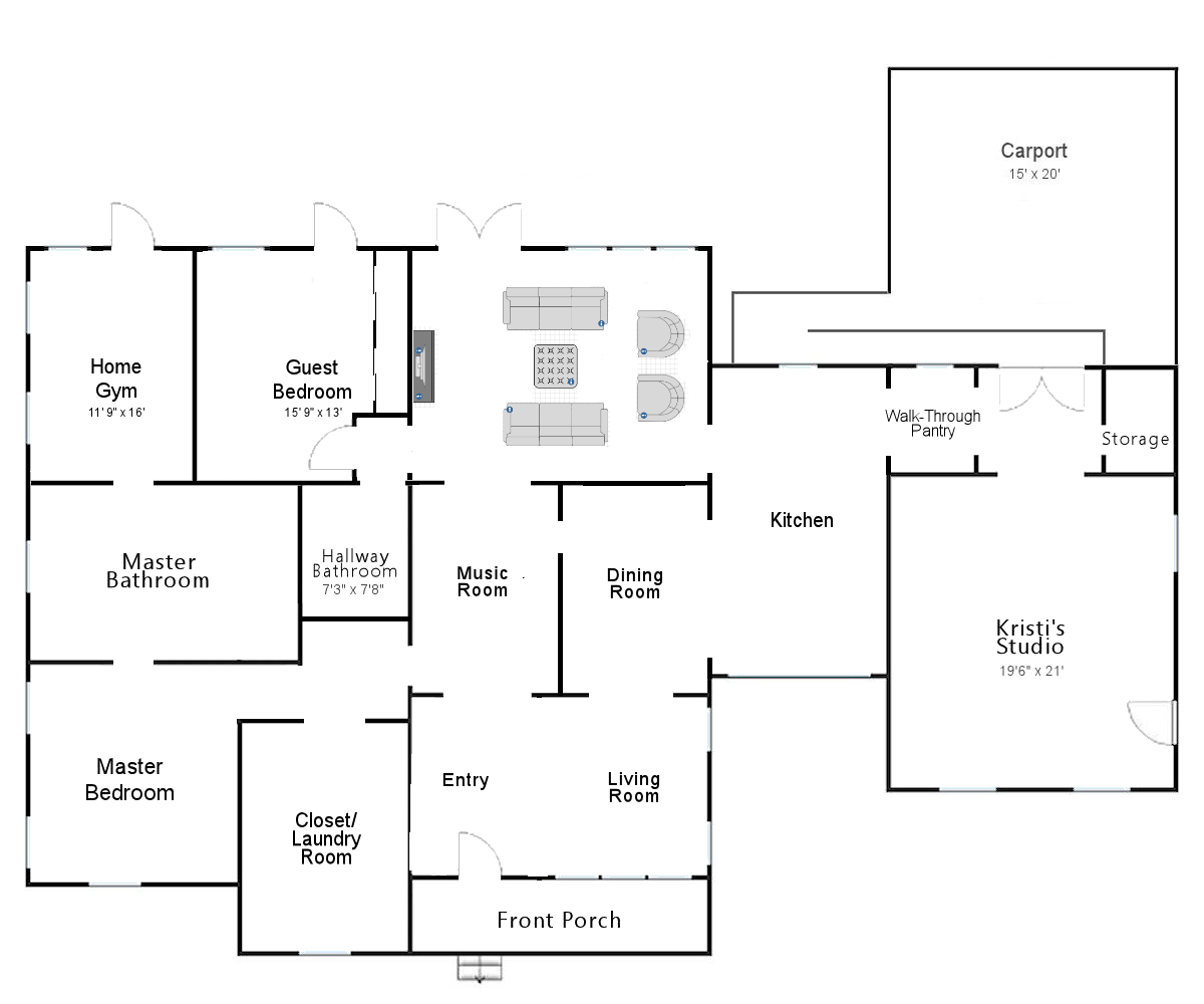
And then several readers suggested moving the kitchen over to the current breakfast room and pantry area, but Jenny’s idea of turning those rooms into the kitchen plus turning the studio bathroom into a walk-through pantry that is easily accessible from the carport was absolute gold. Never in a million years would I have thought of that idea, and yet, it seems so perfect!

The Closet & Laundry Area
I actually didn’t think I was struggling with this area at all. I had a very clear vision of how this room could be designed, and it just made sense to me to line up the closet on one wall…


And then put the laundry room on the other wall…
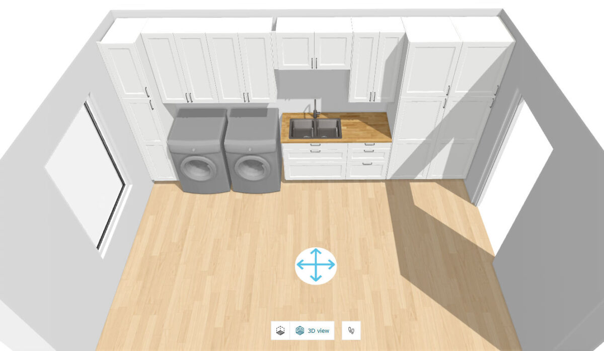

So when Phoebe came along with her suggestions, I initially didn’t think I needed any changes. The more I looked at it, though, the more I realized how brilliant her design is. I can’t wait to get started on this room!! As of this moment, this is the room I’m the most excited about.


The Driveway
Two days ago, I was outside with spray paint in hand trying to determine how to connect the street entrance to our driveway to the driveway section at the side of our house. I was sharing on Instagram, and clearly having trouble getting it to look right. Here’s a screenshot from one of my Instagram stories. You can see how I was angling the driveway right off the street.


Here’s another look. Sorry for the bad picture. It’s a screenshot of a video, and I was facing right into the sun. But you can see how I had the curve starting almost immediately.


So once again, a reader came to my rescue. She comments under the username Sewducky, and she just happens to be a civil engineer. She saw that I was clearly struggling, and sent me an email with a description of what I needed to do (with technical terms, some of which were way over my head 😀 ), but luckily, she also sent a drawing. I can follow drawings.
I won’t say that they followed her plan exactly. Trying to get these guys to slow down and talk out a plan when they’re going full speed to get a job done is quite the task. But they followed the general suggestion, and it looks so much better than how I had sprayed it out!


The main suggestion was to go in straight with the first part of the driveway, as if it were going directly to the studio, and then angling over to meet the side portion.


It looks so nice, and I’m so thankful she swooped in to help me out when I was clearly having a hard time with it.
Those are just the big designs that readers have helped me out with. There are a thousand other small decisions y’all have helped me with over the years. I feel like I owe y’all a huge party when this is all done!


Addicted 2 Decorating is where I share my DIY and decorating journey as I remodel and decorate the 1948 fixer upper that my husband, Matt, and I bought in 2013. Matt has M.S. and is unable to do physical work, so I do the majority of the work on the house by myself. You can learn more about me here.
